Posts

Concerned by the Privacy or Results of Google Search? Try These Other Search Engines

Google is big. Google Search generated $225 billion in revenue in 2022, thanks in part to being the default search engine on all Apple devices. To retain that position—and continue to reap the ad revenue that it generates—Google pays Apple about $18 billion every year. Along with Apple, Google pays billions to phone manufacturers like Samsung, LG, and Motorola; major wireless carriers such as AT&T, T-Mobile, and Verizon; and browser developers like Mozilla and Opera.

So is Google Search’s 90% market share because it’s the best search engine or because Google has enough money to pay distributors for top placement?

Along with concerns about whether Google is the best search engine, some people worry about Google collecting information about them to show targeted ads alongside search results. The more information Google has on users, the argument goes, the better that ads can be targeted, and the more likely it is that users will click the ads, which generates money for Google from advertisers. Others worry that Google’s results may reflect certain types of bias.

If you’re perturbed by the privacy implications of Google knowing everything you search for, or if you’ve found Google’s search results less helpful than you’d like, you can easily switch to another search engine to see if you prefer its results and privacy stance.

How to Switch Search Engines

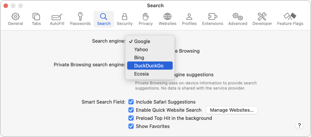
For many Apple users, the main place to choose a preferred search engine is in Safari’s settings. On the Mac, choose Safari > Settings > Search and choose the desired search engine from the Search Engine pop-up menu. You can choose a different one for Private Browsing windows if you want.

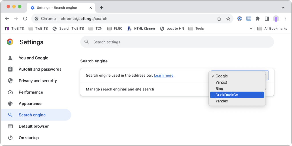
In Chrome-based browsers like Google Chrome, Arc, Brave, Microsoft Edge, and Opera on the Mac, open the settings and look for Search Engine. A pop-up menu lets you choose from some standard options, and additional choices let you add search engines like Brave Search that are too new (or not paying) to appear. Firefox offers similar options when you choose Firefox > Settings > Search.

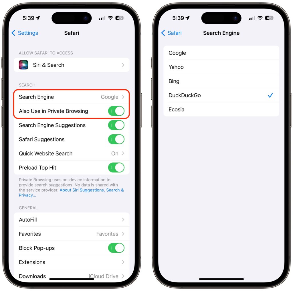
On the iPhone and iPad, go to Settings > Safari >  Search Engine. Again, if you want a different search engine in Private Browsing tabs, turn off Also Use in Private Browsing and choose another option.

Top Alternative Search Engines

Conceptually, what search engines do is simple—they search a set of Web pages for matching keywords and return a list of them in order of relevance to the user. The hard part is dealing with the number of pages—estimates suggest Google indexes 50 billion pages and Bing 4.5 billion—and scaling the service to respond instantly to tens or hundreds of millions of queries per day. (Google processes 8.5 billion searches per day; Bing handles 400 million.) Beyond Google, here are the main search engines and what sets them apart. (You will also likely see Yandex, sometimes called “the Google of Russia.” Avoid it. For so many reasons.)

  • Bing: The second-most popular (though far, far behind Google) search engine in the world, Microsoft’s Bing sets itself apart with a busy, highly designed search results page that mixes a variety of results. It may work well for you, or you may find it overwhelming and difficult to parse. Microsoft is also putting a lot of effort into chat-based AI-powered results. Bing claims to offer more user privacy than Google, but it’s still tracking users to target ads better. If Bing has better privacy than Google, it may mostly be due to not being part of the larger Google data-collection empire.
  • Yahoo: Though it was the first Web search engine, Yahoo hasn’t run its own index since 2009. Today, Yahoo’s search results are powered by Microsoft Bing, so while the look of the search results page may differ, the results should be identical to Bing’s. Yahoo’s privacy stance is also similar to Bing’s.
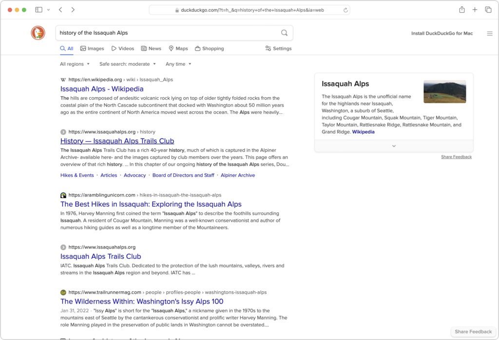
  • DuckDuckGo: If privacy is paramount, DuckDuckGo is worth a look because it does not track or store user information at all. Instead, it chooses ads to display only by matching with search keywords. Although it uses Bing for some of its results, DuckDuckGo also incorporates information from numerous other sources, so it won’t seem like an exact clone of Bing.
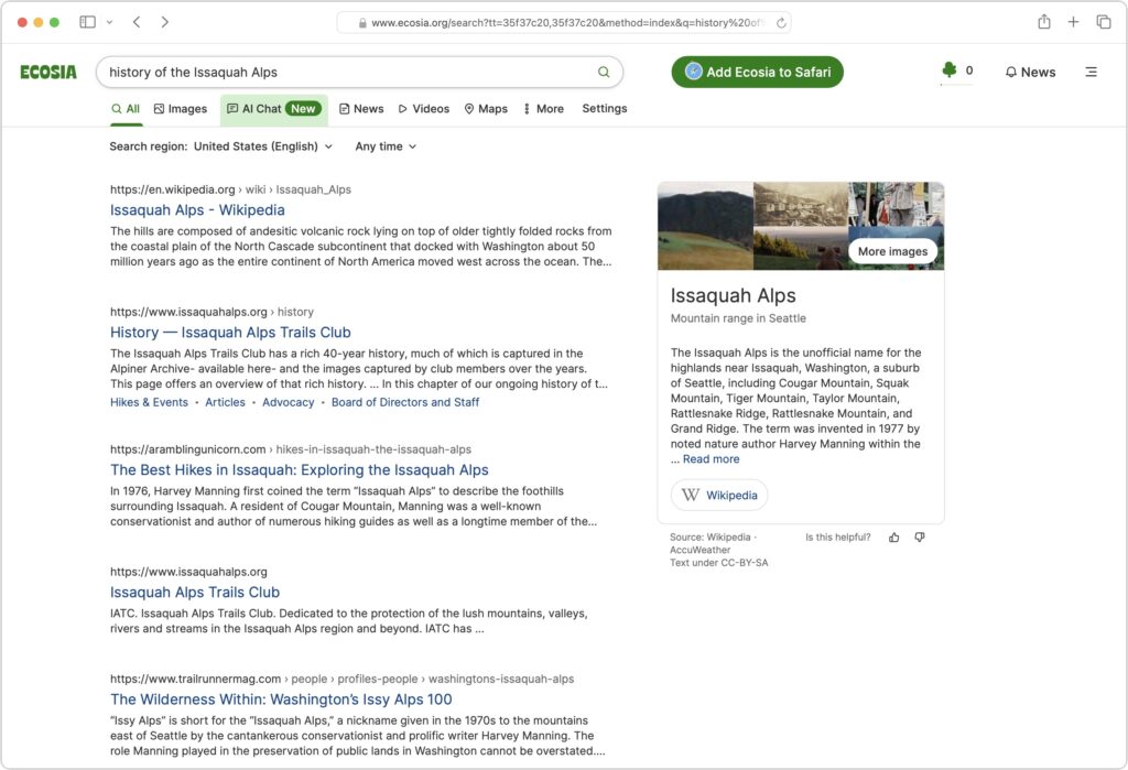
  • Ecosia: The main reason to use the Berlin-based Ecosia is if you like Bing’s results (but not its layout) and want to support a “social business” that claims to be carbon-negative, offers full financial transparency, and protects users’ privacy. Founded in 2009, Ecosia today relies entirely on Bing’s search results and ads (clicks on which are how Ecosia earns money), and it claims to have planted over 188 million trees in 35 countries since its inception. It’s hard to argue with Ecosia’s environmental results, but as a search engine, it doesn’t feel special.
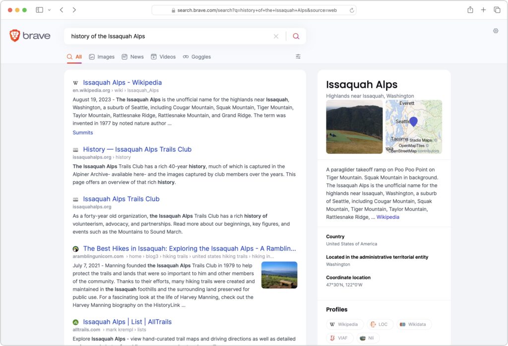
  • Brave Search: A truly independent search engine, Brave Search relies on its own created-from-scratch index (it leaned on Google and Bing for some results early on, but ceased in August 2023). It also emphasizes user privacy and doesn’t track users, searches, or clicks. Although Brave Search displays keyword-based ads by default, users can pay $3 per month for Brave Search Premium, which provides ad-free results pages. You’ll have to set Brave as the default search engine for most browsers manually; for Safari, all you can do is make a favorite to search.brave.com.
  • Kagi: Speaking of paid search engines, if you really want to avoid ads, Kagi is another independent search engine that rolls its own index and provides access only to subscribers, eschewing ads entirely. You can sign up for a 100-search test account, and if you like it, pay $5 per month for 300 searches or $10 per month for unlimited searches. As with Brave Search, you must manually set Kagi as the default search engine (there’s an extension for Safari).

The “best” search engine is the one that gives you the answers you want without triggering privacy worries or concerns about bias. If you want to see if something other than Google will work better for you, set it as your default search engine and try it for a few weeks.

(Featured image by iStock.com/Prykhodov)


Social Media: Have you become disillusioned by Google due to its search quality or how it tracks your activity to serve targeted ads? You can try other search engines that promise to protect your privacy and provide independent search results.

Faster Copying of Two-Factor Authentication Codes from Messages

One welcome feature of Safari is its automatic detection and auto-filling of SMS-based two-factor authentication codes you receive in Messages. It allows you to complete your login quickly, without having to retrieve the code from Messages. But what if you use a different Web browser, like Google Chrome, Firefox, Brave, or Arc? Apple doesn’t allow other developers access to those codes in Messages, but Messages itself recognizes the verification code, marking it with an underline. Rather than transcribing the code manually like an animal, you can Control-click the underlined numbers and choose Copy Code. Then, switch to your Web browser and press Command-V to paste it. Not all websites accept pasted codes, but most will, even if they present a custom interface.

(Featured image by iStock.com/Galeanu Mihai)


Social Media: Need to enter SMS-initiated two-factor authentication codes manually in Web browsers other than Safari? Try this hidden trick for quickly copying and pasting them instead of retyping all those numbers.

AutoFill in Safari Not Working? Set “My Card” in Contacts

We heard from a client that AutoFill in Safari suddenly stopped entering her name and address in Web forms when she chose Edit > AutoFill Form or pressed Command-Shift-A, forcing her to enter her contact information manually, like an animal. (And yes, the “Using information from my contacts” checkbox was selected in Safari’s AutoFill preferences.) Although we have no idea what caused the problem, the solution turned out to be simple. She went into Contacts, found her personal contact card, and chose Card > Make This My Card. Give this a try if you’re having trouble with AutoFill or haven’t yet started using it in Safari.

(Featured image by Adam Engst)

Export Passwords from Safari to Ease the Move to a Password Manager

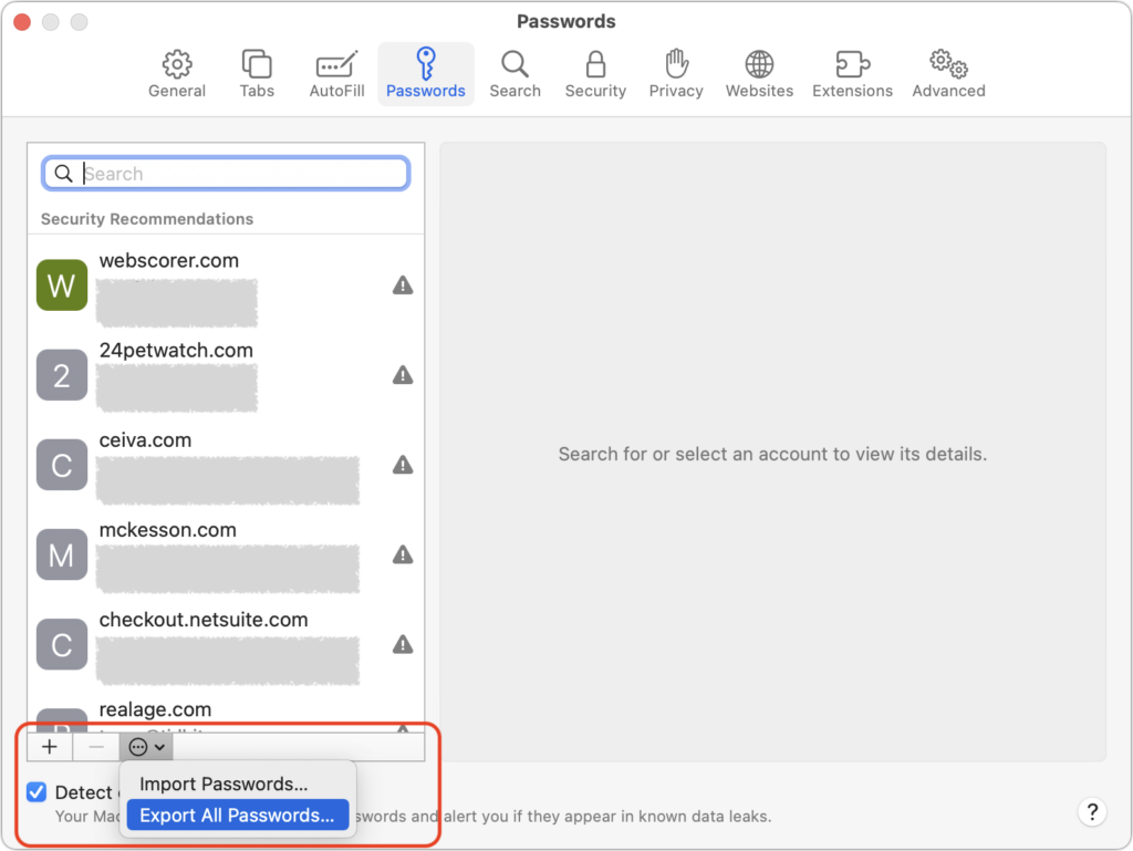
Although Apple has improved the built-in password management features in macOS and iOS (you can now add notes to password entries!), third-party password managers like 1Password and LastPass are still more capable. For those still getting started using a password manager, another new capability will ease the transition: Safari password export. To export a CSV file of your Safari passwords, choose Safari > Preferences > Passwords, and enter your password when prompted. From the bottom of the left-hand sidebar, click the ••• button, choose Export All Passwords, and save the Passwords.csv file to the Desktop. After you import the file into 1Password (instructions), LastPass (instructions), or another password manager, be sure to delete the exported file and empty the trash.

(Featured image by iStock.com/metamorworks)

Safari 15.1 Reverses Course, Reverts to Old Tab Interface

With the betas of Safari 15 on the Mac and iPad, Apple experimented with a variety of interface tweaks related to tabs. By the time Safari 15 shipped, however, Apple had pulled back on the more radical changes from the betas, offering the new Compact Tab Bar layout and colorized tab bar as options. Even with the more traditional Separate Tab Bar layout, however, tabs appeared as buttons above your favorites, a switch from earlier versions of Safari. With Safari 15.1 in macOS and iPadOS 15.1, Apple has reverted the Separate Tab Bar layout even further, making the tabs look like, well, tabs, moving them below the favorites, and eliminating the colorized tab bar (it remains an option in iOS 15.1). The Compact Tab Bar option remains available for those who prefer it, but if you’ve been feeling the sand shifting under your feet, it’s not your imagination—tabs really did change in Safari 15.1.

(Featured image by iStock.com/ESOlex)

New Features to Try (Or Not) in Safari 15

Along with a new version of Safari in iOS 15 and iPadOS 15, Apple has released Safari 15 for macOS 11 Big Sur and macOS 10.15 Catalina. Why do this before macOS 12 Monterey ships? Some of the browser’s new capabilities—notably the Tab Groups feature—integrate it more deeply into your Apple device experience by syncing across devices. So, assuming you have Safari 15 on at least some of your devices, what’s new, and is it any good?

New Tab Bar Interface

For Safari 15, Apple tried to minimize the tab bar interface to occupy less screen real estate and stand out less from the content of Web pages by co-opting the color of each page. Early betas were met with a litany of complaints from testers, and Apple pulled back in the eventual releases, offering settings that let you retain the old interface. How that plays out varies between the iPhone, iPad, and Mac:

  • iPhone: Apple combined the address bar and tab bar into a single set of controls at the bottom of the screen, where they’re easier to reach with your thumb while working one-handed and where you can swipe left and right to switch tabs. Plus, the status bar area at the top of the screen takes on the color from the current site, which isn’t necessarily a visual win. This is a huge change from the controls appearing at the top, so if you don’t like it, go to Settings > Safari and switch from Tab Bar (below left) to Single Tab (below right). Turn off Allow Website Tinting (also below right) if you don’t like the colorizing.
  • iPad: Displays on the iPad are relatively small, so saving some vertical space with the new Compact Tab Bar could be helpful. However, since the tab bar automatically minimizes when you scroll down a page, reducing its size when it’s visible isn’t as much of a win as it might seem. And the colorized tab bar can be shockingly bright. In Settings > Safari, you can choose between Compact Tab Bar (below top) and Separate Tab Bar (below bottom); either way, consider disabling Show Color in Tab Bar.
  • Mac: Laptop screens aren’t huge, and Safari doesn’t minimize its tab bar when you scroll, as it does on the iPhone and iPad, so saving some vertical space might be welcome on a smaller screen. But the way the Compact layout embeds the address field inside a tab and reduces the number of buttons you can see may perturb you (below top). Once again, the colorized tab bar can be glaring. To revert to something closer to the old look, in Safari > Preferences > Tabs, select Separate for the tab layout (below bottom), and disable Show Color in Tab Bar to keep the controls gray regardless of the site color.

Voice Search

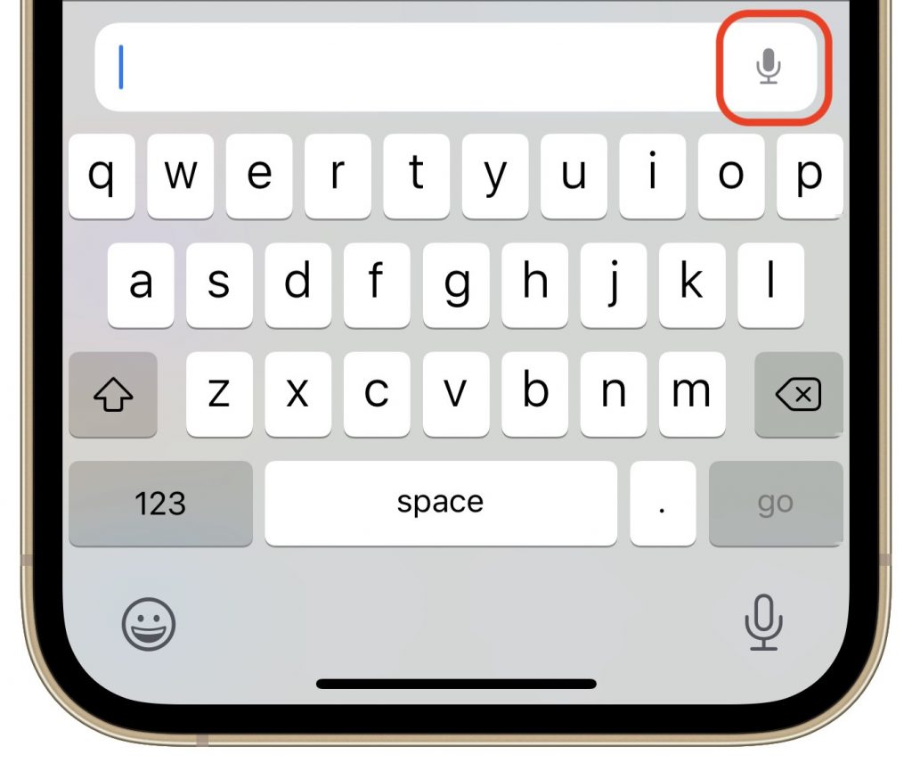
For many searches, it’s easier to speak than type, and Apple has made doing that even faster with Voice Search on the iPhone and iPad. Tap the current tab to display the address field, tap the microphone button, and speak instead of typing. As soon as you stop, Safari performs the search. You can even navigate directly to a site by speaking its URL, like “apple dot com.” Sadly, Apple didn’t extend this feature to the Mac version of Safari 15.

Tab Switcher

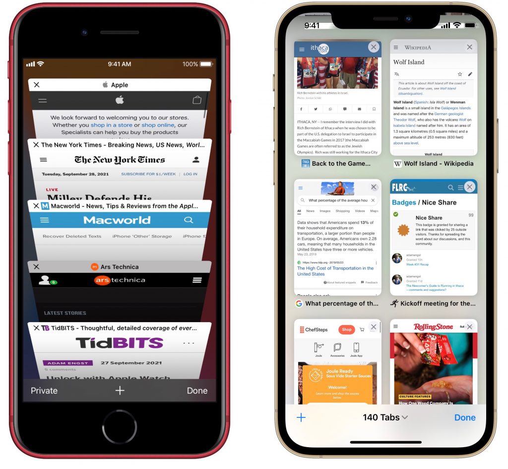
In iOS 14 and earlier, Safari used a card stack metaphor for its tab switcher (below left), which could make it hard to see what each tab contained. In Safari in iOS 15, Apple took a cue from the iPad and Mac versions of the app and moved to a grid interface for the tab switcher (below right). You can drag the tab thumbnails around to organize them and remove them by tapping an X button (weirdly located in the upper-right corner) or swiping them left off-screen. You can also bring up the option to close all open tabs by pressing and holding Done at the lower right corner of the screen.

Tab Groups

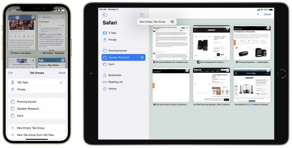
If you struggle under the cognitive load of dozens of unrelated tabs, the new Tab Groups feature might help. With it, you can collect tabs into as many groups as you like and switch among them. You work with tab groups in either the tab switcher interface (iPhone and iPad with the Separate Tab Bar) or the sidebar (Mac and iPad with the Compact Tab Bar).

To open the tab switcher on the iPhone, tap the tab button in the lower-right corner of the screen; on the iPad, tap the different-looking tab button in the upper-right corner. Once you have the tab switcher open, tap X Tabs to reveal the Tab Groups menu. To show the sidebar on either the iPad or the Mac, tap or click the sidebar button in the upper-left corner of the tab bar.

Once you have the Tab Groups menu or sidebar showing:

  • To create a new tab group on the iPhone’s or iPad’s Tab Groups menu, tap New Empty Tab Group, name it, and tap Save. In the sidebar on a Mac or iPad, use the New Tab Group button at the top (or choose File > New Empty Tab Group on the Mac). You can also use New Tab Group from X Tabs to create a tab group from currently open tabs.
  • To switch to a different tab group, tap it in the Tab Groups menu on an iPhone or iPad, or access it from the sidebar on a Mac or iPad.
  • To delete a tab group, swipe left on it in the Tab Groups menu or sidebar to reveal a delete icon on an iPhone or iPad; on the Mac, Control-click it and choose Delete.

Shared with You

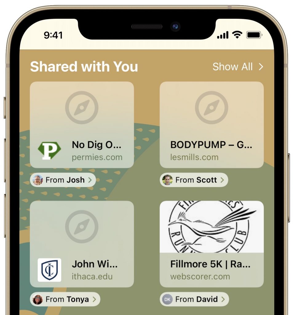
Ever gone spelunking through Messages to find a link someone sent you? Safari 15’s new Shared with You feature should help. It automatically collects all Web pages you receive in Messages into a new Shared with You section of the Safari start page. On the iPad and Mac, there’s also a Shared with You item in the sidebar.

Customizable Start Page

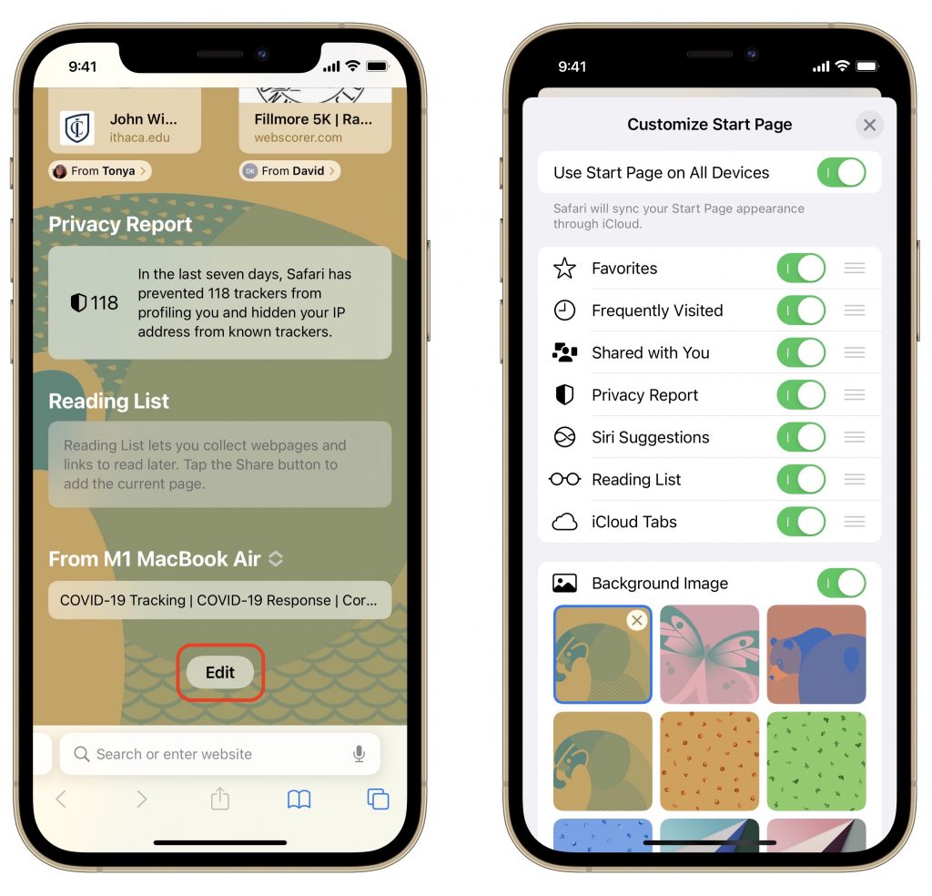
Speaking of the start page, if you want to customize which headings appear and in what order, you can now do that on the iPhone and iPad. (Choosing which headings appear has long been possible on the Mac by clicking the little settings button in the lower-right corner, but reordering isn’t possible there.)

Create a new tab to view the start page, scroll to the bottom, and tap Edit. Then disable any headings you don’t want to see and drag the remaining ones into your desired order. You can also choose among several Apple-provided background images and have your start page settings sync to your other devices.

Other Stuff

Two final new features may be welcome but probably won’t rock your world:

  • Pull to refresh: If you need to reload a Web page on the iPhone or iPad, either you can tap the reload button in the address field if it’s visible with your tab bar settings, or you can now just pull down with your finger from the top of a page.
  • HTTPS upgrade: If you visit a website that supports encrypted HTTPS but is also loading insecure content over unencrypted HTTP, Safari will now ensure that you connect to it over HTTPS so your entire connection is secure.

There you have it! Check out the new features in Safari 15 and let them improve your browsing experience.

(Featured image based on an original by iStock.com/Evgenii Mitroshin)


Social Media: Safari 15 brings some welcome new features, along with tab bar interface changes that have received mixed reviews. Read on to learn about the features and how you can customize the tab bar more to your liking.

Choose Your Preferred Default Web Browser and Email App in iOS and iPadOS 14

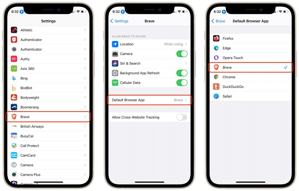
Since the earliest days of the iPhone, Apple’s Safari and Mail have been the default Web and email apps for iOS and, later, iPadOS. There was no way to choose alternatives that would be used whenever an app wanted to open a Web page or create an email message. That has now changed with iOS 14 and iPadOS 14. To switch to a different Web browser (such as Brave, DuckDuckGo Privacy Browser, Firefox, Google Chrome, Microsoft Edge, or Opera Touch) or a different email app (such as Boomerang, Chuck, Hey, Gmail, Outlook, Polymail, or Spark), follow these directions. In Settings, tap the name of the browser or email app you want to set as the default. Then tap Default Browser App or Default Mail App and select the desired app.

(Featured image based on an original by Sotiris Gkolias from Pexels)

Here’s How to See Full URLs in Safari’s Smart Search Field

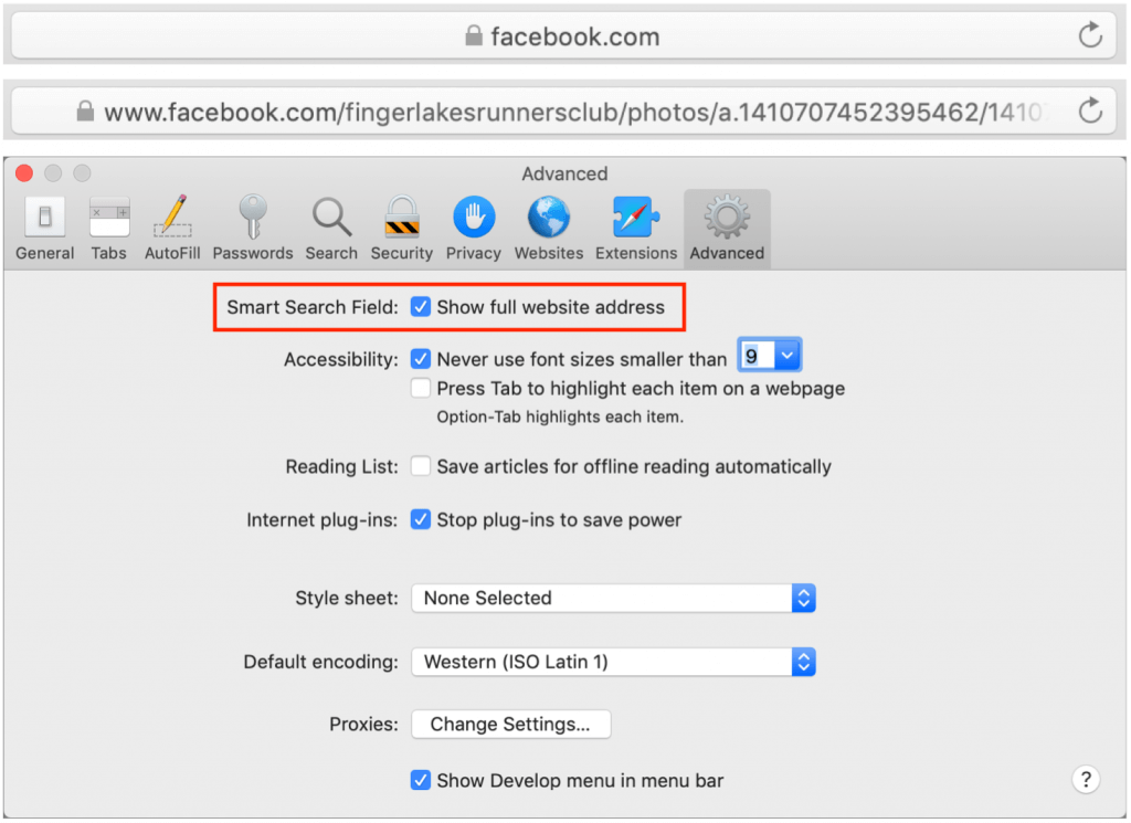
By default, Safari on the Mac hides full Web addresses—technically known as URLs—from you, showing just the site name in the Smart Search field at the top of the window. If you click in the field or press Command-L, the full URL appears, which is good for checking that you’re really where you think you should be and not on some dodgy site. It’s also useful if you need to copy just a portion of the URL to share or otherwise work with. To make that check easier, go to Safari > Preferences > Advanced and next to Smart Search Field, select “Show full website address.” Then you can verify that the URL looks right with a glance.

(Featured image by Matthew T Rader from Pexels)

Read More Easily on the iPhone with Safari Reader

Do you sometimes find it difficult to read articles on your iPhone because of ads, banners, extraneous layout, social media icons, and too-small fonts? We certainly do, and there’s often a quick fix for the myriad ills of modern Web pages: Safari Reader. Whenever you see the Safari Reader icon to the left of the site’s domain name in the address bar, tap it to switch to a cleaner view that dispenses with all the unnecessary trimmings and presents the content in a larger, more readable font. Tap the font  icon at the right side of the address bar in Safari Reader to change the font, font size, and background color. Safari Reader isn’t always available, and it can occasionally fail to format an article properly, but it’s a big win when you can use it.

(Featured image by Atlas Green on Unsplash)

Clean Up Old Tabs in Safari in iOS with This Quick Trick

Every time you tap a link to open a Web page in Safari on your iPhone or iPad, it automatically opens a new tab. That’s fine until you realize that you have oodles of old tabs open, making it difficult to find any particular tab. To close all your old tabs in one fell swoop, press and hold on the tab button, then tap Close All X Tabs in the popover that appears.