Considering a New iMac? Wait No Longer—Updates Are Here!
The iMac has long been the core of Apple’s desktop lineup, but it hasn’t received any updates since June 2017. Now, however, Apple has quietly updated the 21.5-inch iMac with Retina 4K display and the 27-inch iMac with 5K Retina display while keeping prices the same. The bargain-basement non-Retina 21.5-inch iMac remains for sale, but received no changes.
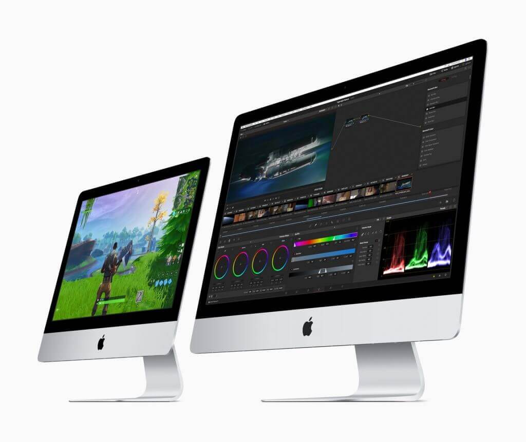
These updates are targeted at improving performance, so you won’t see any changes to the case, screen, or even networking capabilities. But if faster CPUs, GPUs, and memory are what you want, now’s a good time to buy.
The new 21.5-inch iMac boasts speedier 8th-generation Intel quad-core processors and an optional 6-core processor at the top of the line that deliver up to 60% faster performance than previous models. For even greater speed boosts—Apple claims up to 2.4 times faster performance—look to the 27-inch iMac, which now offers 9th-generation 6-core Intel Core i5 processors running at 3.0, 3.1, or 3.7 GHz. If that’s not enough, you can choose an 8-core 3.6 GHz Intel Core i9 processor for the best performance short of an iMac Pro.
Modern computers rely heavily on graphics processors for both silky smooth screen drawing and computationally intensive tasks. By default, both new iMac models have updated versions the previous Radeon Pro graphics chips, but anyone who needs more power can instead choose a blazingly fast Radeon Pro Vega. For the 21.5-inch model, Apple says the Radeon Pro Vega is up to 80% faster; for the 27-inch iMac, it’s up to 50% faster.
Note that both iMacs now use 2666 MHz RAM instead of the previous 2400 MHz RAM. It probably won’t make much of a performance difference, but it’s worth keeping the speed in mind if you’re buying RAM separately from the iMac.
For those ordering an iMac from the online Apple store, if the options you want are in the top-level configuration, start there rather than in the next configuration down. It’s possible to configure two Macs to have the same options for the same price but get a better Radeon Pro graphics processor if you start from the top-level configuration.
For storage, we generally recommend SSDs over Fusion Drives—add external storage if you need more space. Whatever you do, don’t buy an iMac with an internal hard drive because it will destroy the performance.
For those looking for the ultimate power in an iMac Pro, Apple also quietly added options for 256 GB of RAM (for a whopping $5200) and a Radeon Pro Vega 64X GPU ($700) while simultaneously dropping the prices on some other RAM and storage options.
Social Media: After a nearly two-year gap, Apple has updated the 21.5-inch and 27-inch iMacs with faster processors, more capable graphics chips, and faster memory—all for the same prices as before. Read more at: