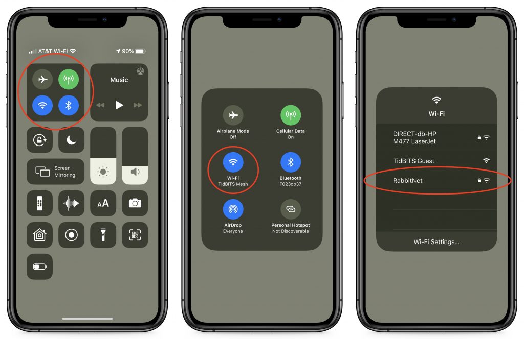
Although most of what’s new in iOS 12 are new features, one change for change’s sake may throw you. In iOS 11 on an iPad, you would bring up Control Center by swiping up from the bottom of the screen, just like on all iPhones other than the iPhone X. With iOS 12, however, Apple brought the iPad in line with the iPhone X and the recently released iPhone XR, XS, and XS Max. Swiping up from the bottom of the screen on the iPad now reveals the Dock, and if you continue swiping, the App Switcher. But no Control Center! To bring up Control Center, swipe down from the upper-right corner of the screen—use the Wi-Fi and battery icons as a reminder.
https://f11photo.com/wp-content/uploads/sites/13/2018/10/Control-Center-iOS-12-iPad-photo.jpg8001280F-11 Photohttps://f11photo.com/wp-content/uploads/sites/13/2023/06/PR-F11Photo-logo.jpgF-11 Photo2018-10-01 09:06:002018-11-01 08:22:24Apple Moved Control Center in iOS 12 on the iPad—Here’s Where to Find It
The Mac’s Dock gives you quick access to frequently used apps, documents, and folders, and makes it easy to switch to a running app. In macOS 10.14 Mojave, the Dock has another feature: a list of apps you’ve used recently that aren’t on your default Dock. Icons for these apps appear between your Dock’s default apps and any documents or folders that you’ve added—look closely and you’ll notice subtle lines in the Dock that delineate this area. It always holds at least three apps, but expands to hold as many launched apps (note the subtle dot under the icon) as necessary; as you quit apps, their icons disappear until you’re back down to three. If you don’t like this change, turn off “Show recent applications in Dock” in System Preferences > Dock.
https://f11photo.com/wp-content/uploads/sites/13/2018/10/Mojave-Dock-photo.jpg8001280F-11 Photohttps://f11photo.com/wp-content/uploads/sites/13/2023/06/PR-F11Photo-logo.jpgF-11 Photo2018-10-01 09:05:002018-11-01 08:22:24Have You Noticed That Mojave’s Dock Shows Recent Applications?
The feature Apple is promoting most heavily with macOS 10.14 Mojave is Dark mode, which the company advertises as “a dramatic new look that helps you focus on your work… as toolbars and menus recede into the background.” Let’s look at what Apple has done with Dark mode, after which you’ll have a better idea of what to think about while trying it.
Enable Dark Mode
First, to turn Dark mode on, go to System Preferences > General and click the Dark thumbnail to the right of Appearance. Mojave immediately switches to Dark mode, turning light backgrounds dark and swapping the text color from dark to light.
While you’re in System Preferences, click over to the Desktop & Screen Saver preference pane. If you scroll down in the Desktop Pictures list, you’ll discover a bunch of new wallpapers that blend well with Dark mode.
Dark Mode Support and Controls
You’ll notice that the color change takes place instantly not just in the Finder, but also in any apps that support Dark mode. Most of Apple’s apps support Dark mode and third-party developers are rapidly adding support to their apps as well. However, Dark mode requires explicit support from apps, so older apps that aren’t being updated will maintain their standard dark-on-light color schemes.
Some apps, such as Maps and Mail, give you additional options that change just how dark they get. In Maps, choose View > Use Dark Map to toggle between a dark map style and the familiar map style that mimics a paper map. Similarly, in Mail, go to Mail > Preferences > Viewing and deselect “Use dark backgrounds for messages” to return to a white background.
If you generally like Dark mode but have trouble reading light text on a dark background due to the reduced contrast, you may be able to choose a different font or style in the app’s preferences that makes the text more readable. Apps like Mail give you a fair amount of that sort of control.
For even more control over contrast, open System Preferences > Accessibility > Display. There you’ll find a Display Contrast slider that lets you make text lighter and backgrounds darker. You can also select Reduce Transparency to make it so items like the Dock and menu bar are solid colors, rather than allowing the background to bleed through. To separate dark and light further, select Increase Contrast, which increases the brightness of divider lines as well.
The Dark Side of Dark Mode
Contrast is necessary for pulling out fine details, but too much contrast can be uncomfortable or even painful—think about how you feel when someone turns on a bright light in a previously dark room. For visual comfort, it’s usually best to match your screen with the lighting of your surroundings. That’s why people who often work at night or with the window blinds down like dark modes—a bright screen seems brighter in a dimly lit room. That’s the theory behind the traditional dark text on a light background too, since the room will be quite light during the day.
So Dark mode can run into two problems. First is that using it during the day or in a brightly lit room may create an uncomfortable contrast between the screen and its surroundings. Controlling your room lighting can eliminate this as an issue. Second and more troubling, even apps that support Dark mode may have large content areas that are bright white, creating a strong contrast between the content area and the rest of the app. Many Web sites in Safari have this effect, as do documents in apps like Pages and Numbers. There’s no way around this scenario.
Even if Dark mode isn’t perfect, it’s worth a try if you have trouble looking at bright screens. Regardless, if it goes too far for you, one of the new dark wallpapers may be easier on your eyes. While most people aren’t overly light sensitive, a non-trivial percentage of the population is, particularly those who suffer from migraines or who have endured concussions, and those with a variety of ocular conditions. And if you’re on the other end of the spectrum—if Dark mode looks dirty and is hard to read—just stick with the traditional Light mode.
Social Media: Apple is promoting macOS 10.14 Mojave’s new Dark mode heavily. Read on to learn if it might be for you, how you can tweak its contrast settings, and what problems you might encounter.
https://f11photo.com/wp-content/uploads/sites/13/2018/10/Dark-mode-photo.jpg8001280F-11 Photohttps://f11photo.com/wp-content/uploads/sites/13/2023/06/PR-F11Photo-logo.jpgF-11 Photo2018-10-01 09:04:002018-10-31 08:12:44Understanding Dark Mode in macOS 10.14 Mojave
Apple has thrown back the curtain on its latest batch of iPhones and a new model of the Apple Watch. The company also announced plans to release iOS 12, watchOS 5, and tvOS 12 on September 17th. macOS 10.14 Mojave will follow a week later on September 24th.
X Appeal: The New iPhone XS, iPhone XS Max, and iPhone XR
Last year’s iPhone X was a massive hit, so Apple has gone further down that road, dropping the Home button and Touch ID and focusing on Face ID in this year’s iPhones. There are three models: the mid-level iPhone XS (pronounced “Ten Ess”), the big iPhone XS Max, and the less-expensive iPhone XR.
You can pre-order the first two on September 14th, and they’ll ship a week later. Those who want an iPhone XR will have to wait until October 19th to pre-order. Here’s how the pricing shakes out:
iPhone XS: 64 GB for $999, 256 GB for $1149, 512 GB for $1349
iPhone XS Max: 64 GB for $1099, 256 GB for $1249, 512 GB for $1499
iPhone XR: 64 GB for $749, 128 GB for $799, 256 GB for $899
What do you get for your money? All three new iPhones rely on Apple’s new A12 Bionic chip, which promises faster performance and reduced power consumption compared to last year’s A11 Bionic. Along with snappier overall responsiveness, the A12 Bionic enables new computational photography capabilities. Users of these iPhones will enjoy Smart HDR, which combines multiple images behind the scenes to produce better photos, and depth-of-field editing for adjusting the background behind a photo’s primary subject.
Apple also improved the camera hardware, enhancing the dual 12-megapixel rear-facing cameras in the iPhone XS and XS Max with larger, deeper pixels and an improved True Tone flash. The iPhone XR lacks 2x optical zoom because it has only a single rear-facing 12-megapixel camera, but thanks to the A12 Bionic’s processing power, it can still take photos in Portrait mode and do depth-of-field editing. The rear-facing cameras on all three models can capture up to 4K video at 60 frames per second—now with stereo sound. The front-facing camera on each iPhone is a 7-megapixel TrueDepth camera that can also capture 1080p video.
If you carry separate work and personal phones, or if you travel abroad frequently, you’ll appreciate the new dual-SIM capability that lets these iPhones support two phone numbers simultaneously, each with their own plan.
What differentiates these iPhones from one another? One big difference is the screens.
iPhone XS: 5.8-inch OLED “Super Retina HD” display with a 2436-by-1125 resolution at 458 ppi
iPhone XS Max: 6.5-inch OLED “Super Retina HD” display with a 2688-by-1242 resolution at 458 ppi
iPhone XR: 6.1-inch LCD “Liquid Retina” display with a 1792-by-828 resolution at 326 ppi
Apple makes much of the iPhone XR’s LCD display, which is essentially a newer and larger version of the screen in last year’s iPhone 8. It won’t look as good as the OLED screens in the iPhone XS models, but unless you’re watching a lot of video or playing photo-realistic games, you may not notice.
Another difference between these models is size. The iPhone XS is the smallest, clocking in at a few millimeters and grams under the iPhone XR. On the other end of the spectrum, the iPhone XS Max has essentially the same dimensions as the previous iPhone Plus models.
The other major difference between the iPhone XR and the iPhone XS models is the case material. The iPhone XS models have glass backs and are edged in stainless steel that comes in silver, space gray, and gold. In contrast, the iPhone XR features colorful aluminum casings in red, yellow, white, coral, black, and blue. Both are gorgeous, but if you’re like many people, a protective case will prevent you from appreciating the case material.
Should you consider upgrading to one of these new models? If your existing iPhone is on life support, absolutely. And, if you want the latest and greatest, the iPhone XS models are the best iPhones ever, particularly for photography. But for those with functional iPhones from the past few years, these new models are less compelling, especially since iOS 12 promises to speed up older devices as far back as the iPhone 5s.
If you decide to buy one, which model you choose probably depends on how much you’re willing to spend since these are Apple’s most expensive iPhones ever. The iPhone XR combines modern technology with a lower price than the other two models, and the decision between the iPhone XS and XS Max comes down to size and cost. Finally, if the prices for the new models are too high, you can still get the iPhone 7 starting at $449 and the iPhone 8 at $599.
Apple Watch Series 4: Bigger Screens and Health Monitoring
In a first for the Apple Watch line, Apple changed the size and shape of the Apple Watch Series 4, boosting the vertical screen dimensions to 40mm and 44mm, up from 38mm and 42mm, and making the screens a little wider to retain the same proportions. However, the new models are 1.1mm thinner and thus have less total volume. You’ll want to try on the different models before buying to see how they look and feel on your wrist. Happily, the Series 4 can use the same bands as previous models.
Apple claims the new display, which extends into the corners of the screen, is “edge-to-edge,” and while there still is a black border, it’s smaller than before. The overall viewing area is about 30% larger.
To use the extra screen space effectively and show off the power of its new S4 chip, the Series 4 comes with some new faces. The Infograph face can incorporate up to eight complications, the Breathe face moves in time with a deep breath, and Vapor, Fire, Water, and Liquid Metal faces animate behind virtual clock hands.
More practically, the Apple Watch Series 4 incorporates new and enhanced sensors. Later this year, the electrodes built into the Digital Crown and the back crystal let you record an electrocardiogram and, after 30 seconds, receive a heart rhythm classification that can identify signs of atrial fibrillation. Recordings are stored securely in the Health app, where you can share them with doctors. Even if you don’t use the ECG app manually, the Series 4 analyzes your heart rhythms in the background and alerts you if it detects irregular rhythms or if the heart rate exceeds or falls below a threshold.
Plus, the Series 4 can now use its accelerometer and gyroscope to detect hard falls. If you fall, the Apple Watch sends you an alert, and if you don’t move for 60 seconds after the notification, it calls emergency services and notifies your emergency contacts of your location.
Other improvements include a speaker that is 50% louder, a relocated microphone to make calls clearer, haptic feedback in the Digital Crown, a back made of sapphire crystal and ceramic for better cellular reception, and Bluetooth 5 for faster data transfer over greater distances.
All this technology comes at a cost, and Apple has raised prices to match. GPS-only models of the Apple Watch Series 4 cost $399, and cellular-capable models are $499 (plus you’ll need to pay an additional $10–$15 for a cell plan). The Apple Watch Series 3 remains available at lower prices: $279 for GPS and $379 for cellular. You can pre-order on September 14th, and the Series 4 will ship on September 21st.
Our take is that the new health-monitoring features of the Apple Watch Series 4 are compelling for anyone who is concerned about falls or heart monitoring. But the increased prices may steer those who are mostly interested in fitness features and iPhone notifications to the cheaper Series 3.
Social Media: It’s official! Apple has announced the snazzy new iPhone XS, massive iPhone XS Max, and budget-friendly iPhone XR, along with the Apple Watch Series 4, which could literally save your life. Read more on our blog:
https://f11photo.com/wp-content/uploads/sites/13/2018/09/iPhone-XS-photo.jpg8001280F-11 Photohttps://f11photo.com/wp-content/uploads/sites/13/2023/06/PR-F11Photo-logo.jpgF-11 Photo2018-09-13 13:25:002018-10-01 03:23:50Apple Unveils New iPhone XS, XS Max, and XR, and the Apple Watch Series 4
When you double-click a document, macOS uses the document’s file extension to figure out which app should open the file. So, by default, a PDF file called laser-squid.pdf opens in Preview because the Finder knows that everything with a .pdf extension should open in Preview. But what if you would prefer to open .pdf files in Adobe Reader, or you want comma-separated value (.csv) text files to open in Numbers? To change any mapping, select a file of the type in question and choose File > Get Info to open the Info window. In the Open With section, click the pop-up menu to choose the desired app and then click the Change All button.
https://f11photo.com/wp-content/uploads/sites/13/2018/09/Remap-Open-With-photo.jpg8001280F-11 Photohttps://f11photo.com/wp-content/uploads/sites/13/2023/06/PR-F11Photo-logo.jpgF-11 Photo2018-09-04 13:08:002018-10-01 03:23:51Tired of PDFs or Other Documents Opening in the Wrong App?
Apple may have discontinued its AirPort Wi-Fi base stations, but in a surprise parting gift, the company has released a firmware update to the AirPort Express that gives it AirPlay 2 capabilities like multi-room audio. If you have an AirPort Express connected to speakers through its audio jack, first use AirPort Utility on the Mac or iPhone to update its firmware to version 7.8. Once you do that, you’ll be able to play audio simultaneously through the AirPort Express and to other AirPlay 2–enabled devices, such as the HomePod and Apple TV.
https://f11photo.com/wp-content/uploads/sites/13/2018/09/AirPort-Express-photo.jpg8001280F-11 Photohttps://f11photo.com/wp-content/uploads/sites/13/2023/06/PR-F11Photo-logo.jpgF-11 Photo2018-09-04 13:07:002018-10-01 03:23:51Update AirPort Express Base Stations to Add AirPlay 2
Unless you can palm a basketball, you may not be able to use an iPhone single-handed. But sometimes one hand is all you can spare. If you find yourself in such a situation, give Reachability a try. On a Touch ID–based iPhone, tap (don’t press) the Home button twice to slide the iPhone’s interface halfway down the physical screen, bringing everything into reach of your thumb. On the Face ID–equipped iPhone X, put your thumb in the bottom of the screen—about at the top edge of the Dock if you were on the Home screen—and swipe down. You can use apps normally for a tap or two, and then they’ll expand back to the full screen to show the full interface. If Reachability is off (or if you want to turn it off), go to Settings > General > Accessibility.
https://f11photo.com/wp-content/uploads/sites/13/2018/09/Reachability-photo.jpg8001280F-11 Photohttps://f11photo.com/wp-content/uploads/sites/13/2023/06/PR-F11Photo-logo.jpgF-11 Photo2018-09-04 13:06:002018-10-01 03:23:52A Hidden Trick that Lets You Navigate Your iPhone with One Hand
By default, Apple locates the Dock at the bottom of the Mac’s screen. If that location interferes with you seeing as much of your document windows as you’d like, you can set it to appear only when you move the pointer to the bottom edge of the screen. But there’s a better way: put the Dock on the side of the screen where there’s plenty of horizontal room and it won’t get in the way of most document windows. Open System Preferences > Dock, and select Right or Left from the Position on Screen radio buttons.
https://f11photo.com/wp-content/uploads/sites/13/2018/09/Dock-on-right-photo.jpg8001280F-11 Photohttps://f11photo.com/wp-content/uploads/sites/13/2023/06/PR-F11Photo-logo.jpgF-11 Photo2018-09-04 13:05:002018-10-01 03:23:53Make More Space for Documents by Putting Your Dock on the Side of Your Mac’s Screen
It’s that time of year again, when an Apple user’s thoughts drift to new versions of macOS, iOS, watchOS, and tvOS. Apple announced the new versions in June, and public betas have been available since. But once Apple makes macOS 10.14 Mojave, iOS 12, watchOS 5, and tvOS 12 available for free download, you’ll need to decide when to install each.
(Note that we say when and not if. There’s no harm in delaying major operating system upgrades until Apple has had a chance to squash early bugs. But waiting too long puts you at risk from security vulnerabilities and prevents you from taking advantage of new features. Plus, should you have to replace an Apple device unexpectedly, you will likely have to use the current operating system, which could be awkward if you weren’t ready.)
The hardest upgrade decision comes with macOS 10.14 Mojave. Whereas the last version of macOS—High Sierra—was a refinement upgrade that added few new features, Mojave introduces lots. Some people’s eyes will appreciate Dark mode, and the Dynamic Desktop changes subtly throughout the day. More practically, Stacks help organize files on cluttered Desktops, the Finder’s new Gallery view makes browsing images easier, and Quick Actions in the Finder’s Preview pane and in Quick Look let you work on files without even opening them. Apple significantly enhanced macOS’s screenshot and screen recording capabilities as well. And apps like Home, News, Stocks, and Voice Memos make the jump from iOS.
However, these features are bound to come with quirks and bugs, and Mojave’s new privacy and security controls may cause problems for older software. So we recommend waiting until at least version 10.14.1 or even 10.14.2 before upgrading. That gives you time to make sure your key apps are compatible with Mojave and for Apple to resolve any unanticipated problems.
iOS 12 is a different story, particularly if you have an older iPhone or iPad. That’s because Apple has focused on improving performance for such devices. If your device is bogging down, iOS 12 may give it a new lease on life. Also compelling is Screen Time, which helps you track your usage and set limits if you’re unhappy about how much time you spend giving Facebook your personal data. Screen Time even works for your entire family, so it could make dinner less device-intensive. A beefed-up Do Not Disturb lets you keep your iPhone from nagging you so much, and new features let you tamp down excessive notifications more easily. Finally, if you do the same things repeatedly, Siri Shortcuts can help you create your own Siri voice commands.
Our take is that iOS 12 is a good upgrade. Don’t pull the trigger instantly, since Apple may discover important bugs in the first week or two, but after that, upgrade when you have time to play with the new features.
watchOS 5 is linked to iOS 12, so you can’t upgrade your Apple Watch until your iPhone is running the latest. Most of the changes revolve around the Workouts app, with automatic detection of running workouts, a new Yoga workout, activity competitions, and more. Other new features include a Walkie-Talkie app, the arrival of Apple’s Podcasts app, a smarter Siri watch face, and improved notifications. There’s no downside to watchOS 5, so as soon as iOS 12 lands on your iPhone, set your Apple Watch to upgrade that night.
tvOS 12 is the easiest to agree to install. It’s a minor upgrade, with just a few new features. The most noticeable is a new aerial screensaver of Earth from low orbit, made by the crew of the International Space Station. You can also tap the touchpad of the Siri Remote while an aerial screensaver is playing to see where it was taken. When you start trying to type a password on the Apple TV, a notification on your iPhone lets you autofill that password. And finally, the Apple TV 4K gains support for Dolby Atmos soundscapes. So yeah, install tvOS 12 when it comes out, or let your Apple TV do it automatically.
As much as change can be hard, we’re excited about Apple’s new operating systems. Like you, we probably won’t end up using all the new features, but some will enhance the experience of being an Apple user.
Social Media: Apple is about to release four major operating system upgrades—macOS 10.14 Mojave, iOS 12, watchOS 5, and tvOS 12. When should you take the leap and install them? Short answer: it depends. Long answer: read on!
https://f11photo.com/wp-content/uploads/sites/13/2018/09/When-to-upgrade-2018-photo.jpg8001280F-11 Photohttps://f11photo.com/wp-content/uploads/sites/13/2023/06/PR-F11Photo-logo.jpgF-11 Photo2018-09-04 13:04:002018-09-13 00:29:56When Should You Upgrade to macOS 10.14 Mojave, iOS 12, watchOS 5, and tvOS 12?
Photos on the Mac provides so many editing tools that it’s easy to lose track of how an edited image compares to the original. You can always use the Revert to Original command and then undo it, but that’s fussy. Instead, Photos provides a Show Original button in the upper-left corner, between the window controls and the Revert to Original button. Click and hold it to see your original image; let up to see the edited version again. Even easier, press the M key on your keyboard. The only thing either of those techniques won’t do is show the effect of cropping; to see the uncropped original, press Control-M. And if you just want to see how a particular set of adjustment controls affected the image, click its blue checkmark to turn it off and back on.
https://f11photo.com/wp-content/uploads/sites/13/2018/08/Photos-before-after-photo.jpg8001280F-11 Photohttps://f11photo.com/wp-content/uploads/sites/13/2023/06/PR-F11Photo-logo.jpgF-11 Photo2018-08-01 12:08:002018-09-03 22:57:57The Secret Keyboard Shortcut for Comparing Before/After Edits in Photos on the Mac