Posts

Use Reduce Transparency for a Consistently Colored macOS Interface

For years now, Apple has made transparency a part of the macOS interface, which has the effect of blending the menu bar into the background and making menus and some windows take on the background hue, as you can see on the left side of the illustration below. For many people, transparency blurs the interface, making it harder to differentiate interface elements from the wallpaper. It also causes problems for screenshots meant for publication because the images end up with unrepresentative color levels. To prevent that from happening, open System Preferences > Accessibility > Display and select Reduce Transparency. It can be a significant difference, as you can see on the right side of the illustration below.

(Featured image by Adam Engst)

iOS 15 Allows Rearranging and Deletion of Home Screen Pages

Back in iOS 14, Apple added the App Library, which collects all the apps on your iPhone. With everything available in the App Library, iOS 14 was also able to provide the option of hiding Home screen pages, a boon for those of us with too many disorganized pages. In iOS 15, Apple has taken the next step. You can still hide Home screen pages, but if you never want to see them again, you can delete them (apps remain in the App Library). Or, if they’re not in the order you want, you can rearrange them. Touch and hold any empty spot on the Home screen to enter jiggle mode. Tap the dots above the Dock that indicate which Home screen page you’re on. In the Edit Pages screen, you can now tap the – button next to a hidden page to delete it ➊. If you want to delete a visible page, first hide it by tapping its checkmark underneath ➋. Or, to rearrange Home screen pages, drag a thumbnail to a new location ➌. Tap Done or press the Home button when you’re finished.

(Featured image by Adam Engst)

Keep the Menu Bar Showing in Full Screen in macOS 12 Monterey

Do you like using full-screen mode on your new M1-based MacBook Pro but hate having the menu bar disappear unless you move the pointer to the top of the screen? Happily, in macOS 12 Monterey, Apple has at long last added a setting to keep the menu bar visible at all times. Open System Preferences > Dock & Menu Bar and uncheck “Automatically hide and show the menu bar in full screen.” The change won’t affect apps currently in full-screen mode until you toggle their window state again or quit and relaunch. Unfortunately, some apps, including Apple’s Photos, need to be updated to show toolbars or other controls at the top of the window without forcing you to mouse up there to reveal them.

(Featured image by Adam Engst)

With Apple Watch Faces, Too Much Choice Can Be Confusing

The Apple Watch has a lot to offer older people, including heart rate monitoring, atrial fibrillation detection, fall detection, and electrocardiogram recording. But if you are—or are helping someone who is—of the generation where watches once did nothing beyond telling the time, too many options can be overwhelming. Adding to the confusion is how easy it is to create and accidentally swipe between multiple watch faces, making it so the Apple Watch suddenly looks and works completely differently. If that’s an issue, use the Watch app to delete all but the preferred watch face. In Watch > My Watch, tap Edit to the right of My Faces ➊, tap the red delete button next to a face ➋, and then tap Remove ➌.

(Featured image by Adam Engst)

Safari 15.1 Reverses Course, Reverts to Old Tab Interface

With the betas of Safari 15 on the Mac and iPad, Apple experimented with a variety of interface tweaks related to tabs. By the time Safari 15 shipped, however, Apple had pulled back on the more radical changes from the betas, offering the new Compact Tab Bar layout and colorized tab bar as options. Even with the more traditional Separate Tab Bar layout, however, tabs appeared as buttons above your favorites, a switch from earlier versions of Safari. With Safari 15.1 in macOS and iPadOS 15.1, Apple has reverted the Separate Tab Bar layout even further, making the tabs look like, well, tabs, moving them below the favorites, and eliminating the colorized tab bar (it remains an option in iOS 15.1). The Compact Tab Bar option remains available for those who prefer it, but if you’ve been feeling the sand shifting under your feet, it’s not your imagination—tabs really did change in Safari 15.1.

(Featured image by iStock.com/ESOlex)

Avoid Unusual Top-Level Domains in Custom Domain Names

Remember the heady dotcom days, when businesses were desperate to get a short, memorable, easily typed .com domain? It quickly became difficult to get what you wanted—so much so that deep-pocketed companies paid exorbitant sums for just the right domain.

Before we go any further, let’s make sure we’re all on the same page. Domain names are necessary because computers on the Internet are all identified by inscrutable numeric IP addresses. You can remember and type apple.com easily; 184.31.17.21 not so much. Domain names have two or more parts: the top-level domain (read from the end, such as com) and the second-level domain (like apple), plus optional third-level domains (which could give you support.apple.com).

Since the days of speculating in .com domains, however, hundreds of additional top-level domains have been opened up, including domains from .aaa to .zone. There are now top-level domains for .doctor, .florist, .lawyer, and many more, including the general .xyz. It might be tempting to switch from the awkward dewey-cheatham-howe.com to the shorter and more memorable dch.lawyer. And even if there isn’t a profession-specific top-level domain that works for you, you may think that if abc.xyz is good enough for Google’s parent company Alphabet, surely it’s good enough for you.

Alas, much as we appreciate the creativity and flexibility offered by these alternative top-level domains, we’d like to dissuade you from using one, if possible. Problems include:

  • Email deliverability: If you’re sending email using an alternative top-level domain or including links to that domain, it’s much more likely that your email will be considered spam by receiving systems.
  • SMS deliverability: Some SMS text message providers will automatically delete messages containing URLs with alternative top-level domains in an effort to protect their customers from phishing attacks.
  • Social media spam filtering: As with SMS text messages, social media posts that include URLs with alternative top-level domains may be categorized as spam or as linking to a malicious site.
  • Firewall blocking: Abuse of alternative top-level domains has become so commonplace by scammers that some companies prevent their employees from accessing websites using certain alternative top-level domains at the firewall level.
  • User perception: Although there’s no telling how anyone will react to a particular top-level domain, people won’t think twice about .com but might think .ooo seems sketchy. (We would.)

Obviously, it may not be possible to get the domain name you want in .com. What to do? There are a few strategies:

  • Expand or abbreviate: At this time, people mostly don’t see, remember, or type domains apart from those that go with businesses that do a lot of real-world advertising. So if you need to add or subtract words (or letters) in your domain to find a unique one, that can work.
  • Use a country domain: Two-letter top-level domains are restricted for use by countries, so .us is for the United States, .ca for Canada, and .au for Australia. Every country has different rules for who can register them. For instance, it’s possible to get a domain ending in .it (Italy) as long as you work through a registrar that acts as your representative there. .io (British Indian Ocean Territory) and .ai (Anguilla) are popular top-level domains among tech companies.
  • Stick with better, pricier alternatives: Not all alternative top-level domains are equally problematic. The classic .net and .org are fine, and .biz isn’t bad. But how to determine that? When you’re checking to see if a domain name is available, compare prices. For instance, at one domain name registrar, iphonewhisperer.xyz costs only $1 per year, whereas the iphonewhisperer.biz version is $4.98 per year, iphonewhisperer.net is $9.18 per year, and iphonewhisperer.studio is $11.98 per year. The more you pay, the less likely that domain has been abused by spammers and marked for filtering.

In the end, when it comes to domain names, it’s best to be conservative and stick with a top-level domain that won’t cause people or filters to think twice. That’s probably .com, if you can make the rest of the name work for you.

(Featured image by iStock.com/BeeBright)


Social Media: Tempted to get a short, memorable domain name ending in .xyz or .shop? As we explain, that’s a bad idea if you care about user perception, email and text message deliverability, and not being blocked by social media and firewalls. Details at:

New Features to Try (Or Not) in Safari 15

Along with a new version of Safari in iOS 15 and iPadOS 15, Apple has released Safari 15 for macOS 11 Big Sur and macOS 10.15 Catalina. Why do this before macOS 12 Monterey ships? Some of the browser’s new capabilities—notably the Tab Groups feature—integrate it more deeply into your Apple device experience by syncing across devices. So, assuming you have Safari 15 on at least some of your devices, what’s new, and is it any good?

New Tab Bar Interface

For Safari 15, Apple tried to minimize the tab bar interface to occupy less screen real estate and stand out less from the content of Web pages by co-opting the color of each page. Early betas were met with a litany of complaints from testers, and Apple pulled back in the eventual releases, offering settings that let you retain the old interface. How that plays out varies between the iPhone, iPad, and Mac:

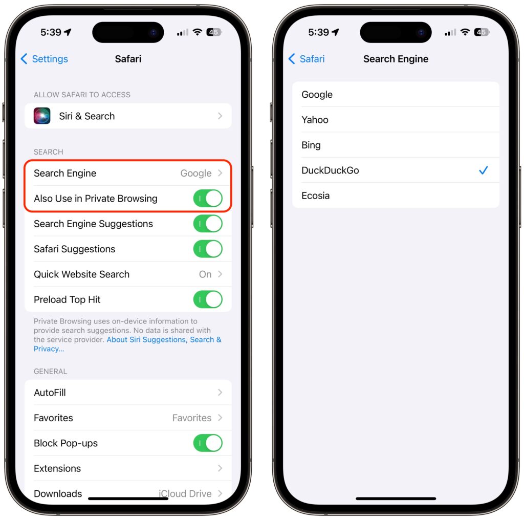
  • iPhone: Apple combined the address bar and tab bar into a single set of controls at the bottom of the screen, where they’re easier to reach with your thumb while working one-handed and where you can swipe left and right to switch tabs. Plus, the status bar area at the top of the screen takes on the color from the current site, which isn’t necessarily a visual win. This is a huge change from the controls appearing at the top, so if you don’t like it, go to Settings > Safari and switch from Tab Bar (below left) to Single Tab (below right). Turn off Allow Website Tinting (also below right) if you don’t like the colorizing.
  • iPad: Displays on the iPad are relatively small, so saving some vertical space with the new Compact Tab Bar could be helpful. However, since the tab bar automatically minimizes when you scroll down a page, reducing its size when it’s visible isn’t as much of a win as it might seem. And the colorized tab bar can be shockingly bright. In Settings > Safari, you can choose between Compact Tab Bar (below top) and Separate Tab Bar (below bottom); either way, consider disabling Show Color in Tab Bar.
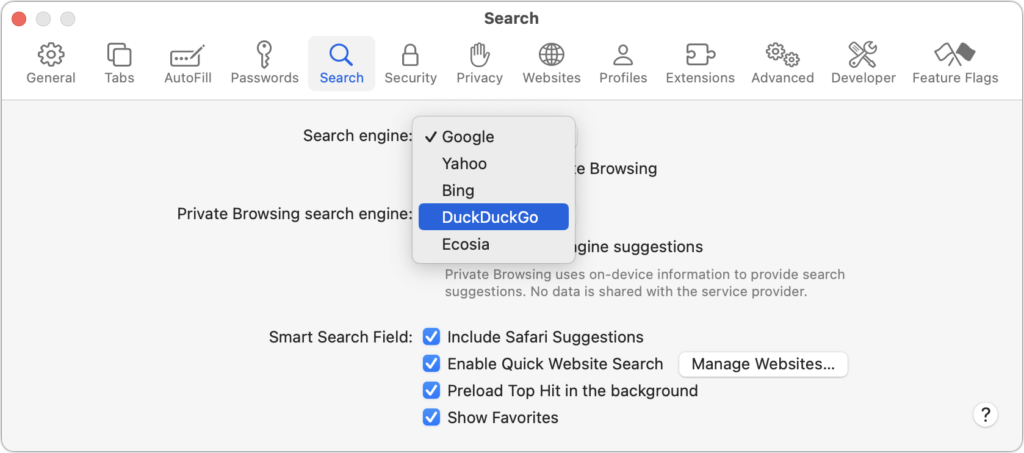
  • Mac: Laptop screens aren’t huge, and Safari doesn’t minimize its tab bar when you scroll, as it does on the iPhone and iPad, so saving some vertical space might be welcome on a smaller screen. But the way the Compact layout embeds the address field inside a tab and reduces the number of buttons you can see may perturb you (below top). Once again, the colorized tab bar can be glaring. To revert to something closer to the old look, in Safari > Preferences > Tabs, select Separate for the tab layout (below bottom), and disable Show Color in Tab Bar to keep the controls gray regardless of the site color.

Voice Search

For many searches, it’s easier to speak than type, and Apple has made doing that even faster with Voice Search on the iPhone and iPad. Tap the current tab to display the address field, tap the microphone button, and speak instead of typing. As soon as you stop, Safari performs the search. You can even navigate directly to a site by speaking its URL, like “apple dot com.” Sadly, Apple didn’t extend this feature to the Mac version of Safari 15.

Tab Switcher

In iOS 14 and earlier, Safari used a card stack metaphor for its tab switcher (below left), which could make it hard to see what each tab contained. In Safari in iOS 15, Apple took a cue from the iPad and Mac versions of the app and moved to a grid interface for the tab switcher (below right). You can drag the tab thumbnails around to organize them and remove them by tapping an X button (weirdly located in the upper-right corner) or swiping them left off-screen. You can also bring up the option to close all open tabs by pressing and holding Done at the lower right corner of the screen.

Tab Groups

If you struggle under the cognitive load of dozens of unrelated tabs, the new Tab Groups feature might help. With it, you can collect tabs into as many groups as you like and switch among them. You work with tab groups in either the tab switcher interface (iPhone and iPad with the Separate Tab Bar) or the sidebar (Mac and iPad with the Compact Tab Bar).

To open the tab switcher on the iPhone, tap the tab button in the lower-right corner of the screen; on the iPad, tap the different-looking tab button in the upper-right corner. Once you have the tab switcher open, tap X Tabs to reveal the Tab Groups menu. To show the sidebar on either the iPad or the Mac, tap or click the sidebar button in the upper-left corner of the tab bar.

Once you have the Tab Groups menu or sidebar showing:

  • To create a new tab group on the iPhone’s or iPad’s Tab Groups menu, tap New Empty Tab Group, name it, and tap Save. In the sidebar on a Mac or iPad, use the New Tab Group button at the top (or choose File > New Empty Tab Group on the Mac). You can also use New Tab Group from X Tabs to create a tab group from currently open tabs.
  • To switch to a different tab group, tap it in the Tab Groups menu on an iPhone or iPad, or access it from the sidebar on a Mac or iPad.
  • To delete a tab group, swipe left on it in the Tab Groups menu or sidebar to reveal a delete icon on an iPhone or iPad; on the Mac, Control-click it and choose Delete.

Shared with You

Ever gone spelunking through Messages to find a link someone sent you? Safari 15’s new Shared with You feature should help. It automatically collects all Web pages you receive in Messages into a new Shared with You section of the Safari start page. On the iPad and Mac, there’s also a Shared with You item in the sidebar.

Customizable Start Page

Speaking of the start page, if you want to customize which headings appear and in what order, you can now do that on the iPhone and iPad. (Choosing which headings appear has long been possible on the Mac by clicking the little settings button in the lower-right corner, but reordering isn’t possible there.)

Create a new tab to view the start page, scroll to the bottom, and tap Edit. Then disable any headings you don’t want to see and drag the remaining ones into your desired order. You can also choose among several Apple-provided background images and have your start page settings sync to your other devices.

Other Stuff

Two final new features may be welcome but probably won’t rock your world:

  • Pull to refresh: If you need to reload a Web page on the iPhone or iPad, either you can tap the reload button in the address field if it’s visible with your tab bar settings, or you can now just pull down with your finger from the top of a page.
  • HTTPS upgrade: If you visit a website that supports encrypted HTTPS but is also loading insecure content over unencrypted HTTP, Safari will now ensure that you connect to it over HTTPS so your entire connection is secure.

There you have it! Check out the new features in Safari 15 and let them improve your browsing experience.

(Featured image based on an original by iStock.com/Evgenii Mitroshin)


Social Media: Safari 15 brings some welcome new features, along with tab bar interface changes that have received mixed reviews. Read on to learn about the features and how you can customize the tab bar more to your liking.

Nightstand Mode Makes Your Apple Watch a Helpful Bedroom Companion

Most Apple Watch users charge their watch every night, putting it on a charger as part of a bedtime routine. If that’s you, make sure you’re not missing one of the Apple Watch’s best features: nightstand mode. When you enable it in the iPhone’s Watch app, in General > Nightstand Mode, a charging Apple Watch displays the charging status, current time and date (in a large, easily readable font), and the time of any alarm you’ve set. It uses a green color that won’t shock your eyes in the middle of the night, and after a minute, the screen goes completely dark. To see it again, tap the watch or—even better!—the surface it’s on. The screen lights up for 10 seconds before going dark again. (And yes, we love the little classic Mac stand.)

(Featured image by Adam Engst)

The Ten Upcoming Mac/iPhone/iPad Features We Think You’ll Most Like

At its Worldwide Developer Conference keynote on June 7th, Apple shared details about what we can expect to see later this year in macOS 12 Monterey, iOS 15, iPadOS 15, watchOS 8, tvOS 15, and HomePod Software 15. It was a firehose of announcements, but one thing became clear: Apple wants to spread its technologies across its entire ecosystem of devices. Although each platform—Mac, iPhone, iPad, Apple Watch, Apple TV, and HomePod—retains its unique qualities, nearly every feature that the company announced works across as many platforms as make sense.

Before we get into the ten features that we think you’ll most like when everything ships in September or October, we should note that Apple was surprisingly silent on one topic: future Apple silicon chips. Many observers had expected Apple to announce an M1X or M2 chip that would power professional laptop and desktop Macs. We’ll have to satisfy ourselves with the impressive performance of the M1-based Macs we have now and wait a little longer for whatever comes next.

On to the hot new features!

Account Recovery and Legacy Contacts Simplify Recovering Account Data

It’s all too common that people forget their Apple ID passwords and can’t access their accounts. Apple hopes to make that a little less stressful with Account Recovery Contacts. Specify someone as your Account Recovery Contact, and they’ll be able to help you reset your password and regain access to your account, with no need to call us or Apple for assistance.

Also welcome will be the addition of Legacy Contacts. Once this feature is available, everyone should make sure they have appropriate family members or friends set as Legacy Contacts. Then, in the event of your untimely death, your Legacy Contacts can access your account and personal information. Using Legacy Contacts will be far easier than having to provide the legal paperwork to Apple to request access to a deceased family member’s accounts.

FaceTime Gains Features That Make It Competitive with Zoom

During the last year, we’ve all spent vastly more time in videoconferencing apps for work, school, and socializing. Alas, Apple’s FaceTime has been a weak entry in that market. With the features Apple is now promising, however, it should compete well with the likes of Zoom, Skype, and Google Meet. FaceTime will finally get a standard grid view, blur your backgrounds with Portrait mode, and offer two microphone modes: Voice Isolation to cut down on background noise (for standard meetings) and Wide Spectrum to leave ambient sound unfiltered (for performances, say). FaceTime will even be able to alert you when you’re talking but muted.

More important yet is the fact that you’ll finally be able to invite Windows and Android users to FaceTime calls using standard Web links. Non-Apple users will have to use a Chrome-based browser like Google Chrome, Microsoft Edge, or Brave. Plus, when you create an event in Calendar, you’ll be able to make a Web link for the call that you can share. And when it’s time for the call, a Join button makes it easy to get in.

Universal Control Lets Macs and iPads Share a Keyboard and Pointing Device

With Sidecar in macOS 10.15 Catalina and iOS 13, Apple made it so you could use an iPad as a secondary screen for a Mac. In macOS 12 Monterey and iPadOS 15, Apple is taking that concept further. With Universal Control, if you merely set a Mac and an iPad next to each other, you’ll be able to use the Mac’s keyboard and mouse or trackpad to work between the two devices (in fact, Universal Control supports up to three). No setup is required—just move your pointer to the edge of the Mac screen and push it “through” the edge to move it to the iPad screen. You can even drag and drop content between devices.

Live Text Lets You Work with Text in Images

Have you ever taken a photo of something just to capture a phone number or address? We have, for sure. Apple’s new Live Text feature treats text in images just like text you type, so you can use functions like copy and paste, lookup, and translate. Live Text will work in Photos, of course, but also in Quick Look, Safari, and Screenshot, and in live Camera previews on the iPhone. It’s an impressive use of image recognition technologies.

Along the same lines, in Photos, you’ll also be able to use the information button on any photo to highlight recognized objects and scenes and get additional information about them. Apple says you’ll be able to learn more about popular art and landmarks, plants and flowers, books, and pet breeds.

Siri Gets Faster, More Reliable, More Private, and More Useful

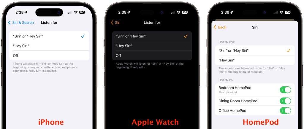
Thanks to the ever-increasing power of the Neural Engine in Apple devices, Apple says it will bring all processing of Siri requests onto your device. That may not sound like a big deal, but it means that Siri should work faster, more reliably, and more privately. It will be faster because there’s no need to send speech to and from Apple’s servers for processing. It will make Siri work more reliably when your iPhone doesn’t have strong cell service and enable offline support for many types of requests. And Apple won’t know what you’re saying at all.

Other Siri improvements will include the capability to announce reminders when you’re wearing AirPods, improved conversation context so you can refer to what you just asked, and support for controlling HomeKit devices at specific times. HomeKit developers will even be able to add Siri support to their products through a HomePod.

Improved Multitasking Controls Come to the iPad

The big problem with Apple’s multitasking options on the iPad has been remembering how to use them. With iPadOS 15, Apple hopes to solve that with a new menu that will appear at the top of apps, with buttons for entering full screen, Split View, or Slide Over.

Apple also added a new multiwindow shelf that appears at the bottom of the screen at launch and provides a Dock-like view of all the open windows in that app. If you ignore it, it fades away quickly, but it should help you remember which windows you have open and access them quickly.

The iPad Finally Gets the App Library and Home Screen Widgets

Last year, in iOS 14, Apple introduced the App Library and Home Screen widgets. The App Library holds all your apps so you can declutter your life by removing them from the Home Screen. And Home Screen widgets let you add app-specific widgets that provide at-a-glance information. Sadly, iPadOS 14 didn’t include those features.

iPadOS 15 rectifies that oversight, adding both the App Library and Home Screen widgets, complete with some larger widget sizes for the larger iPad screen. They’ll work just like on the iPhone. It’s about time!

Locate Lost AirPods Pro and AirPods Max with Find My Network Support

As it stands now, you can theoretically find AirPods using the Find My app. However, it shows only the last position of the AirPods at a general level, and you have to get within range of them to play a sound. In the future, however, the AirPods Pro and AirPods Max will support the Find My network, so other people’s devices can report their location generally, and once you get within Bluetooth range, you can play a sound to locate them.

Hopefully, that will happen less often thanks to new separation alerts that, when enabled, will alert you when you leave an Apple device, AirTag, or Find My-compatible item behind.

Private Relay Protects Safari Traffic for iCloud+ Subscribers

Apple has been adding lots of privacy-protecting features over the past few years, but Private Relay goes even further to ensure that even your ISP can’t track where you go on the Web and sell that data to advertisers. Private Relay encrypts your Safari traffic and passes it through two Internet relays. No one—not even Apple—can then use your IP address, location, and browsing activity to create a detailed profile of you. Everyone who pays for extra iCloud storage will transition to the new iCloud+ for the same cost and will get Private Relay for no additional fee.

While we’re talking about iCloud, Apple also says that you’ll be able to get custom domain names for iCloud Mail addresses and invite family members to use the same domain with their iCloud Mail accounts.

Use AirPlay to Send Audio or Video to Your Mac

Many people have discovered how neat it is to use AirPlay to display photos or videos from an iPhone or iPad on a TV attached to an Apple TV. Macs could also broadcast their displays to an Apple TV. But what you couldn’t do is use AirPlay to send audio or video from another Apple device to a Mac. With macOS 12 Monterey, that will become possible, enabling you to use a Mac’s large screen to play a video, share a Keynote presentation, and more.

Apple’s upcoming operating system releases boast many other new features, and we plan to explore more of them once everything ships in a few months. We’ll let you know when it’s time to update!

(Featured image by Apple)


Social Media: At its Worldwide Developer Conference keynote, Apple announced a boatload of new features that we’ll see in macOS 12 Monterey, iOS 15, iPadOS 15, and watchOS 8 later this year. Here are the ten features we think you’ll most like:

Pin Your Chats in Messages for Faster Access

A new feature of Messages in both iOS 14 and macOS 11 Big Sur is the option to pin up to nine conversations at the top of the conversation list for easy access. No longer do you have to worry about them scrolling out of sight. On an iPhone or iPad, touch and hold a conversation and tap Pin in the menu that appears; on a Mac, Control-click the conversation and choose Pin. (Remove them by repeating the action and choosing Unpin.) Each of your devices can have different conversations pinned. If you are used to scanning the left side of Messages for blue new-message indicators, also be sure to look for those blue dots amongst your pinned icons at the top of the screen. Also, note that on the Mac, it can be a little too easy to see a notification banner about a new message, switch to Messages, and type in the currently selected (but wrong) conversation.

(Featured image by Polina Zimmerman from Pexels)