Posts

Need to Mask Nearby Noise? Try Ventura’s Background Sounds

Do you have trouble concentrating at work because of a loud office environment? Or do you work at home and want to block out the sounds of kids or appliances? In macOS 13 Ventura, Apple added background sounds you can play to mask what’s going on around you. Go to System Settings > Accessibility > Audio and enable Background Sounds. You can pick a sound, set the volume, and select an option to turn the sound off when your Mac is inactive. Next time you’re mentally stewing over it being too loud to work, try this feature. A pair of AirPods (Pro or Max, in particular) might be helpful, too. If you find background sounds helpful but want more variety, look for websites like A Soft Murmur or apps like Noizio.

(Featured image by iStock.com/Apiwan Borrikonratchata)


Social Media: It can be hard to concentrate on your work in a loud office environment or with kids playing in the next room. In macOS 13 Ventura, Apple added background sounds that can help mask the noise around you—give them a try!

Use Reduce Transparency for a Consistently Colored macOS Interface

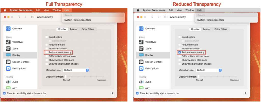
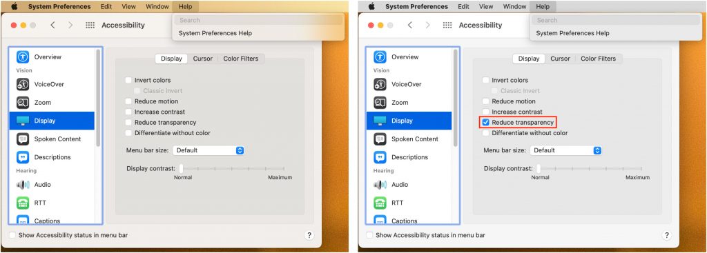
For years now, Apple has made transparency a part of the macOS interface, which has the effect of blending the menu bar into the background and making menus and some windows take on the background hue, as you can see on the left side of the illustration below. For many people, transparency blurs the interface, making it harder to differentiate interface elements from the wallpaper. It also causes problems for screenshots meant for publication because the images end up with unrepresentative color levels. To prevent that from happening, open System Preferences > Accessibility > Display and select Reduce Transparency. It can be a significant difference, as you can see on the right side of the illustration below.

(Featured image by Adam Engst)

Change Your Pointer Color in macOS 12 Monterey

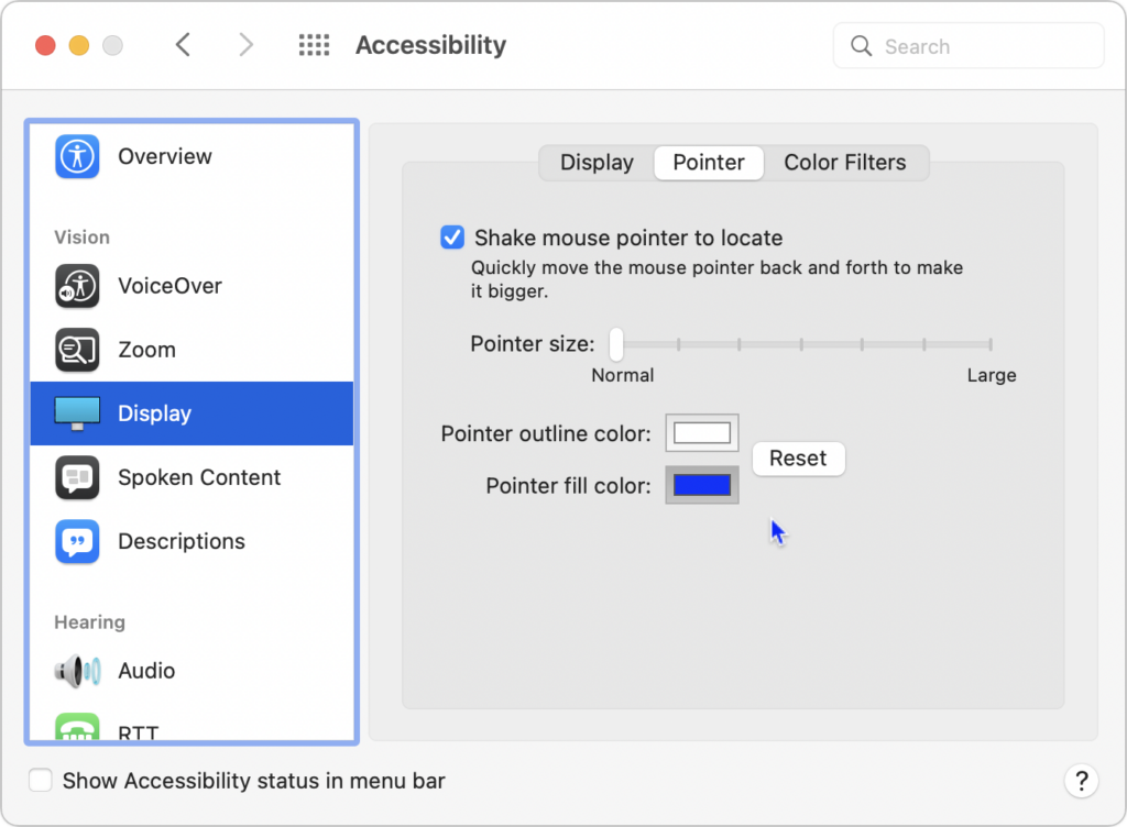
Some people find it hard to find the mouse pointer at times, particularly on a large screen or when working in Dark Mode or in apps with dark interfaces. You’ve long been able to increase the size of the pointer generally and also zoom it temporarily by shaking it, but in macOS 12 Monterey, Apple now lets you change the color of the pointer. That could be a boon to those who have trouble seeing it otherwise. Go to System Preferences > Accessibility > Display > Pointer, click the Pointer Fill Color box, and choose a different color in the color picker. You can also choose a different Pointer Outline Color if that’s helpful. After customizing it, if you decide you prefer the old black-and-white version, click the Reset button.

(Featured image by iStock.com/tahir_duran)

Set Custom Text Sizes on a Per-App Basis in iOS 15

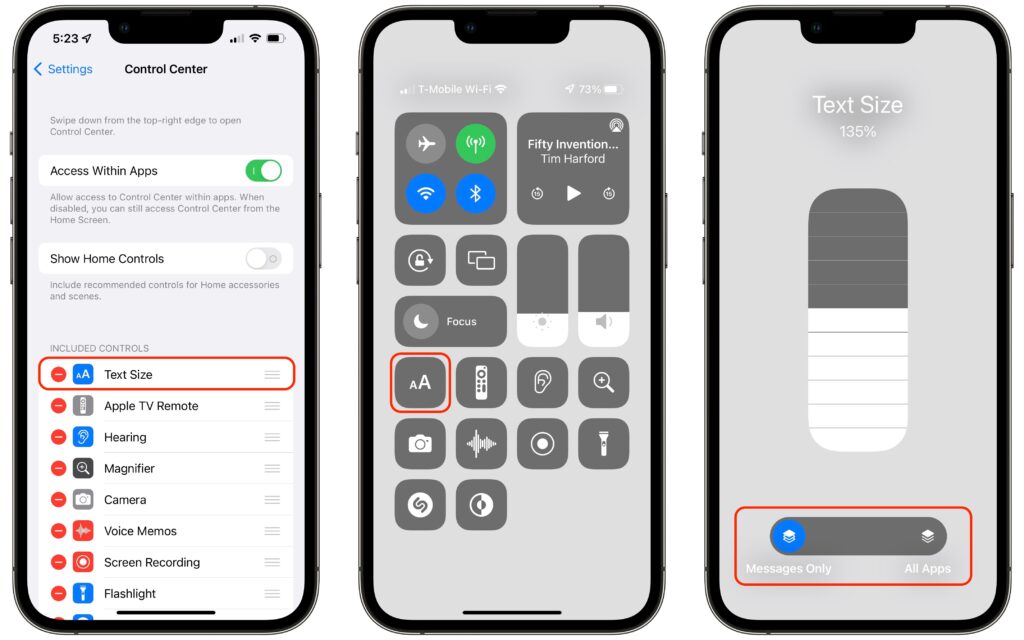
In previous versions of iOS, you could change the systemwide text size to make all apps—at least those that support Dynamic Type—display text at larger or smaller sizes. (Most people who use this feature want the text larger so it’s easier to read with aging eyes.) In iOS 15 and iPadOS 15, however, Apple lets you adjust the text size on a per-app basis, so you can increase it only for those apps where it really makes a difference for you. First, make sure Text Size is showing in Control Center by going to Settings > Control Center, and if it’s not in Included Controls, tap the green + button for it under More Controls. Then, while in an app where you want bigger text, invoke Control Center, tap the Text Size button, move the vertical slider to the desired setting, and then tap the App Only button so the setting affects only that app, not all apps.

(Featured image by iStock.com/SandraMatic)

Not a Fan of Big Sur’s Translucent Menu Bar? Here’s How to Disable It

In macOS 11 Big Sur, Apple went back to a design direction from the earliest days of Mac OS X: a translucent menu bar. Since its color changes depending on the desktop picture, many people aren’t enamored of it (left, below). Luckily, reverting to the traditional opaque menu bar is simple. Open System Preferences > Accessibility > Display and select Reduce Transparency. That will turn the menu bar gray again and make other windows and menus opaque, too (right, below). Simple gray might not be as whizzy as fancy transparency, but it’s more predictable and easier to see.

(Featured image by aung nyi on Unsplash)