Posts

The Many New Lock Screen Customizations in iOS 16

iOS 16 has been out for a bit now, and it’s likely safe to upgrade as long as you don’t rely on obsolete apps that might not be compatible. When you take the plunge, the first new feature to check out is the capability to create, customize, and switch among multiple Lock Screens, each with its own wallpaper, clock font, and widgets. It’s reminiscent of how you customize Apple Watch faces. Plus, you can now link a Lock Screen to a Focus so you know when that Focus is active.
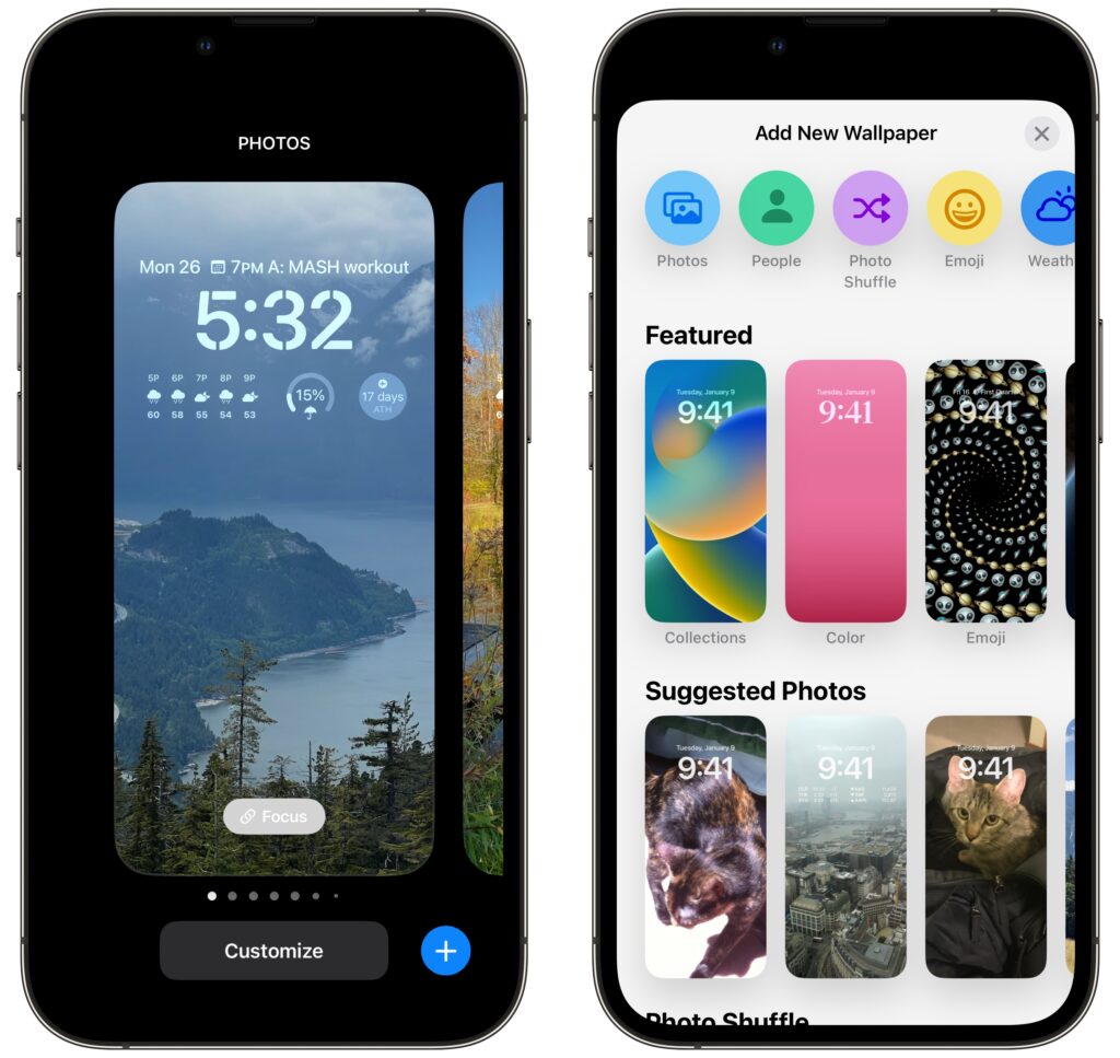
To get started, touch and hold the Lock Screen until the Lock Screen switcher appears. (Your iPhone must be unlocked at this point, which can be a bit tricky with a Touch ID-based iPhone—gently touch the Home button to authenticate, but don’t press it or you’ll open the Home Screen.)

Tap the blue plus button to create a new Lock Screen—see below for how to configure it. Once you have several Lock Screens, swipe left and right to pick one, and tap it to make it active. You can customize aspects of a Lock Screen after creating it by tapping the Customize button, and if you don’t like what you’ve done, delete it by swiping up and tapping the trash button.

Wallpapers

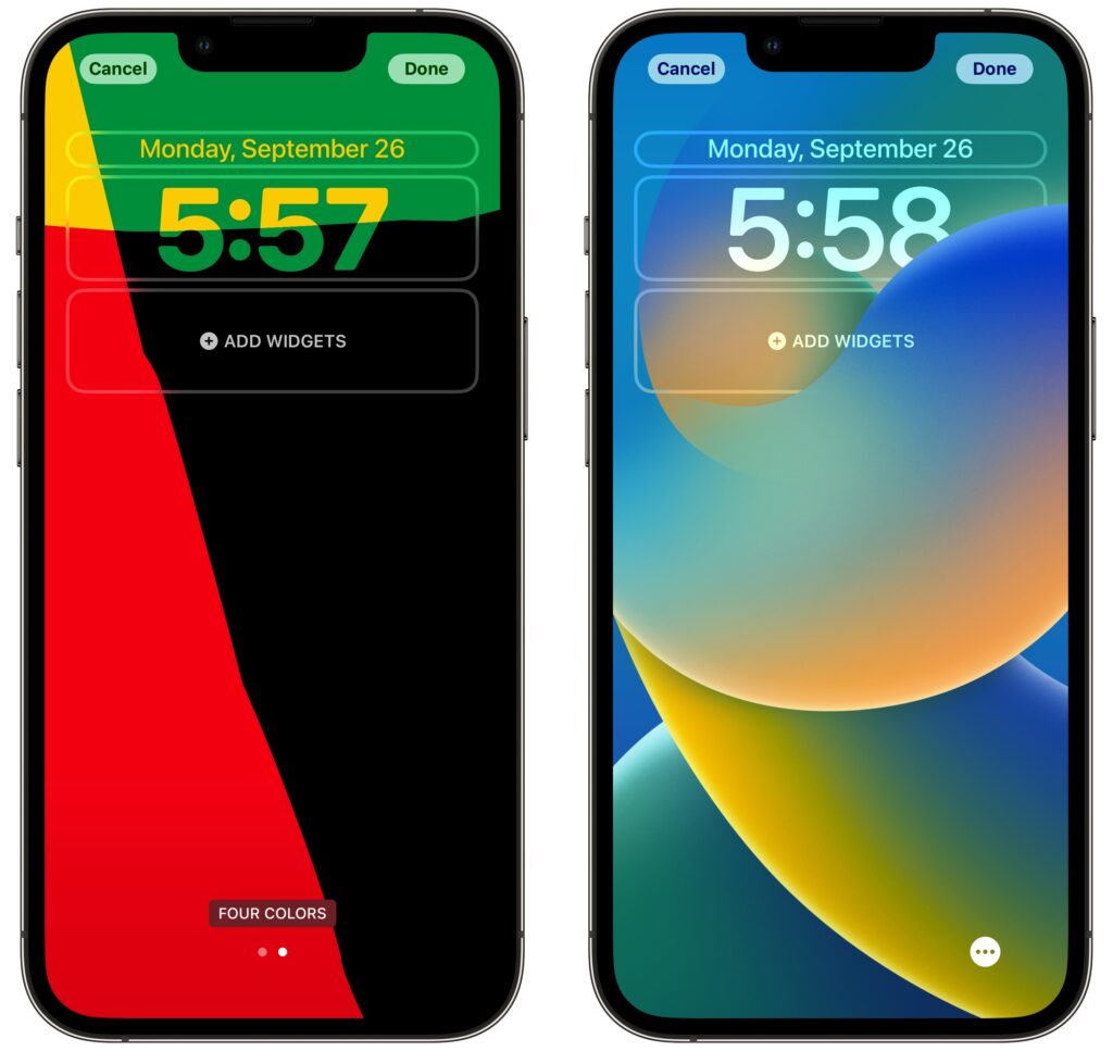
iOS 16 offers seven types of wallpapers, which you select while creating a Lock Screen by tapping buttons at the top or samples in a visual gallery below.

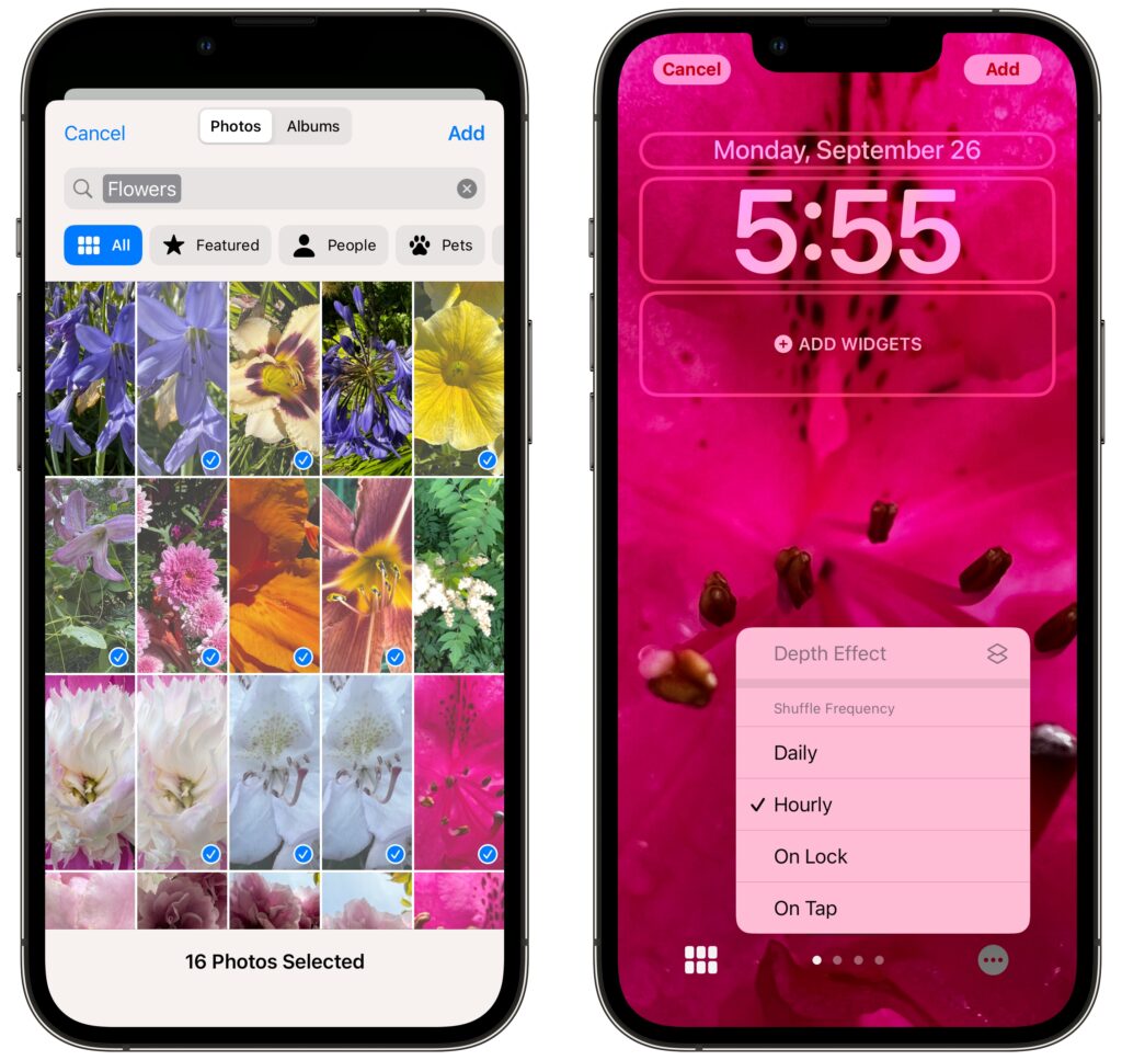
  • Photos: Most people will choose a photo for their wallpaper. iOS 16 uses machine learning to identify images that are likely to work well, separating them with image-selection filters into four categories: People, Pets, Nature, and Cities. You can also scroll through all your photos or particular albums and search for photos. Some people and pets will float above the clock (unless you add widgets), but you can toggle that with the Depth Effect option accessible in the ••• button.
  • Photo Shuffle: Having trouble deciding which photo you prefer? The Photo Shuffle wallpaper automatically selects and switches between photos for you, letting you specify which categories to use, which people to include, and even which individual photos to show or hide (tap the ••• button to remove a suggested photo from the rotation). You can set the photo to rotate with a tap on the Lock Screen, whenever you lock your iPhone, hourly, or daily.
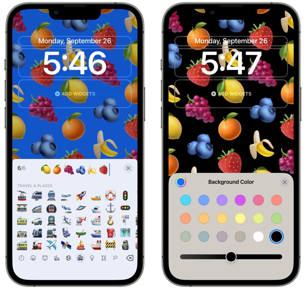
  • Emoji: This wallpaper tiles up to six emoji in several different grid sizes and layouts, and you can change the background color by tapping the ••• button. Thanks to Apple’s quality emoji art, the Emoji wallpaper is surprisingly attractive.
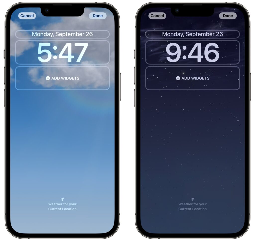
  • Weather: Those who work in windowless offices might particularly appreciate the Weather wallpaper, which changes to reflect the current weather conditions (and time of day) in your location.
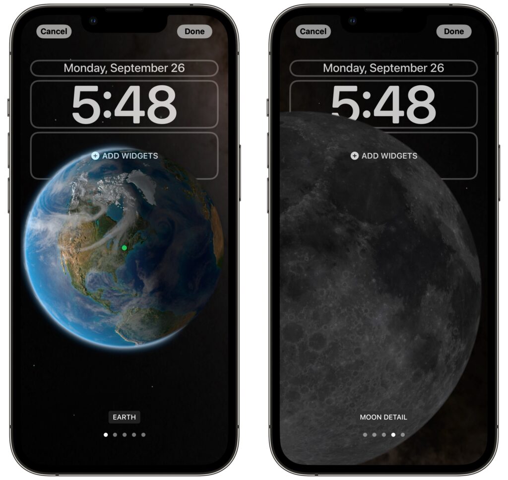
  • Astronomy: For a broader perspective, the Astronomy wallpaper lets you look at the Earth, Moon, or solar system whenever you pick up your iPhone. Swipe to pick your preferred celestial body and zoom level.
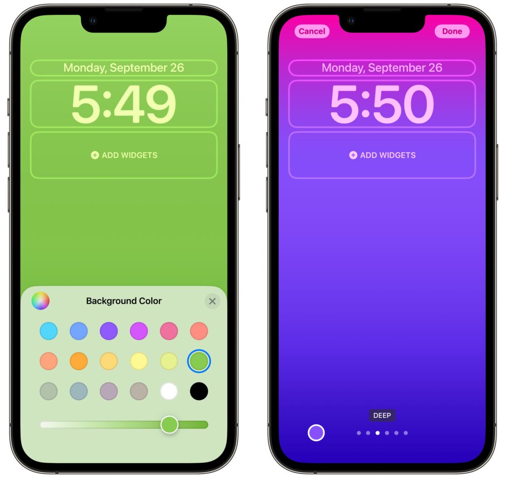
  • Color: Want something simpler? The Color wallpaper lets you choose a background color gradient from the color picker. Swipe to apply different effects.
  • Collections: This category, which appears only in the gallery, provides Apple-designed graphics such as Unity, Pride, and the clownfish wallpaper from the original iPhone.

Take some time to explore all the wallpaper types and their options—the combinations are nearly endless. There’s no downside to creating and switching among different Lock Screens as the mood strikes you.

Clock font and color

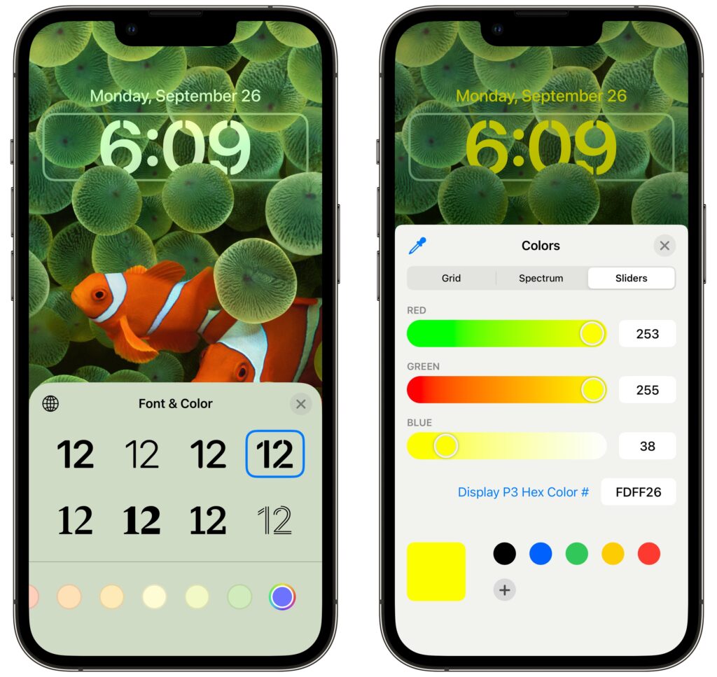
Once you decide on a wallpaper for a Lock Screen, you can customize the clock font and color by tapping the clock. There are only eight font options, but you should be able to find one you like. With color, Apple provides some suggestions below the font choices, but if you scroll all the way to the right and tap the color wheel, you can use iOS 16’s color pickers to select any color. The goal is to make sure it’s readable against the background image you’ve chosen.

Widgets

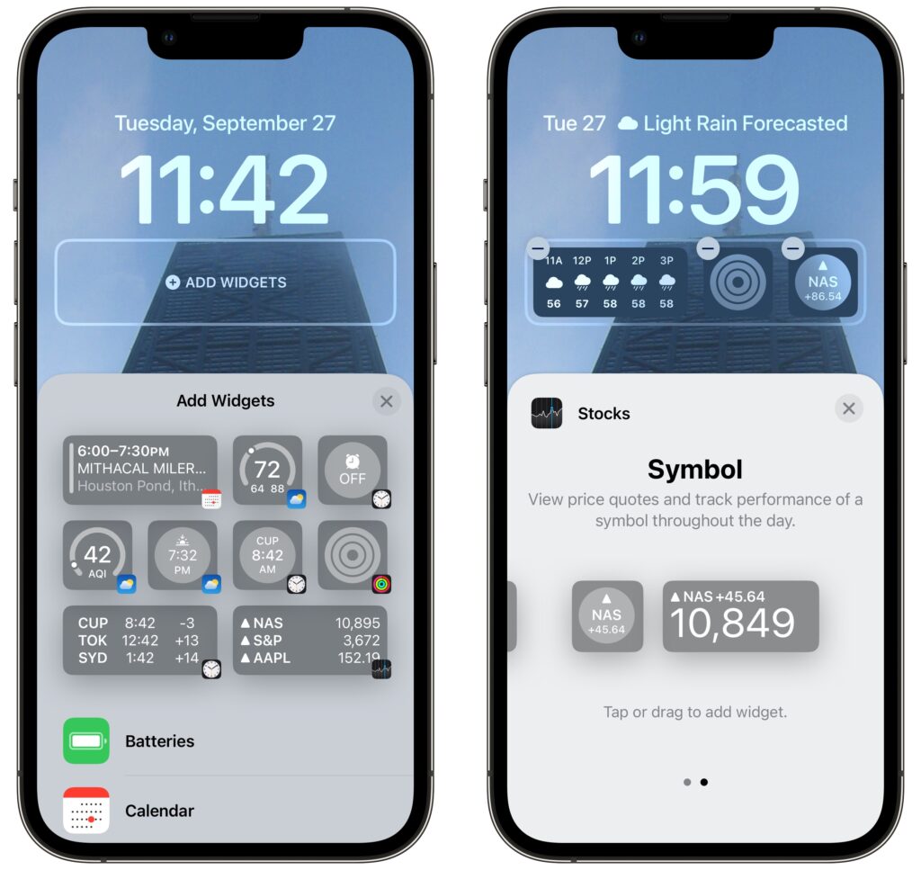
Beyond the eye candy of wallpapers and the customizable clock, widgets make the iOS 16 Lock Screen more useful than ever. Some iPhone users are accustomed to having flashlight and camera buttons on the Lock screen—everyone can now add widgets to two distinct zones on the Lock Screen, above and below the clock. The widget zone above the clock holds only a single line of text or other controls, and it always displays alongside the date, which shrinks if necessary. The zone below the clock is taller and can hold two sizes of widgets: small ones that occupy a single slot and large ones that take over two slots. You can mix and match small and large widgets to fill—or not—the four available slots.

To add widgets, tap the desired zone and tap widgets in the panel that appears. Suggestions appear at the top, but if you scroll down, you can see a list of all the apps that offer widgets. Tap an app to see its widgets—swipe to see the full set it offers. Once you’ve added a widget, you may be able to tap it again to configure it—such as by specifying tickers for the Stocks widget. To rearrange widgets, drag them but be aware that this works poorly at the moment; it may be easier to delete the widgets (tap the ⊖ button) and add them again in the desired order.

Focus

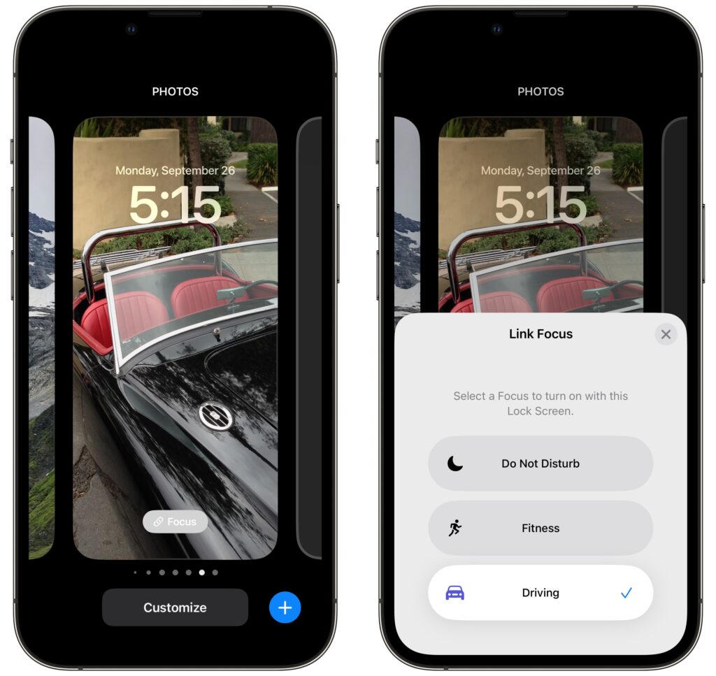
Focus subsumed Do Not Disturb in iOS 15. Although Focus is far more flexible and customizable than Do Not Disturb, that power also makes it hard to predict when notifications will be blocked, since it can be difficult to know when a Focus is active. With iOS 16, Apple has made Focus more obvious by letting you link a Focus to a Lock Screen.

When you’re in the Lock Screen switcher, a Focus button appears toward the bottom of each Lock Screen. Tap it and select a Focus to link them.

Two things become true once you’ve linked a Focus to a Lock Screen:

  • When you activate that Focus in Control Center, or its settings cause it to activate automatically, iOS 16 switches to the linked Lock Screen. That’s handy if you have a manually triggered Focus for family time, for instance, or an automatically activated Focus for Driving.
  • When you switch to a particular Lock Screen, its linked Focus activates and starts blocking notifications. It’s probably easier to activate a Focus in Control Center, but switching Lock Screens has the same effect.

It may take a few weeks to figure out what Lock Screens you prefer and customize them to your liking, but we think you’ll enjoy this new feature.

(Featured image by Adam Engst)


Social Media: iOS 16’s marquee feature is customizable Lock Screens—read on to learn how to make multiple Lock Screens, each with its own wallpaper, clock font and color, and interactive widgets.

Universal Control Arrives in macOS 12.3 and iPadOS 15.4

With the recent release of macOS 12.3 Monterey and iPadOS 15.4, Apple shipped Universal Control, the last major technology promised in its 2021 operating system upgrades. Universal Control enables you to use the keyboard and mouse or trackpad attached to one Mac to control up to three other Macs or iPads—you can even copy and paste or drag items between devices. It’s a great way to make more of your Apple devices while staying on task—no longer do you need to stop using your Mac to accomplish something on your iPad, and if you have both an iMac and a MacBook Air, it becomes trivially easy to use them simultaneously.

Universal Control can simplify grabbing a file from your MacBook Air while using your iMac, or it might make it easy to check something in an iPad-only app without switching from your familiar Mac keyboard and trackpad. For those who would benefit from more screen space, Universal Control simplifies keeping a Web browser window open on one Mac while you’re writing about it on another.

First, make sure all the Macs and iPads you want to use with Universal Control meet its system requirements. macOS 12.3 and iPadOS 15.4 are essential, and most (but not all) Macs and iPads that can run those versions are compatible. All the devices must be signed in to the same iCloud account, that account’s Apple ID must have two-factor authentication enabled, and no device can be sharing its Internet or cellular connection. Bluetooth and Wi-Fi must be turned on, and Handoff must be ​​enabled in System Preferences > General on the Mac and in Settings > General > AirPlay & Handoff on the iPad. That may sound like a lot, but most of those are defaults.

Apple says everything must be within 30 feet (10 meters), but in nearly all cases, you’ll want the devices to sit next to one another so you can easily see what you are doing on all the screens.

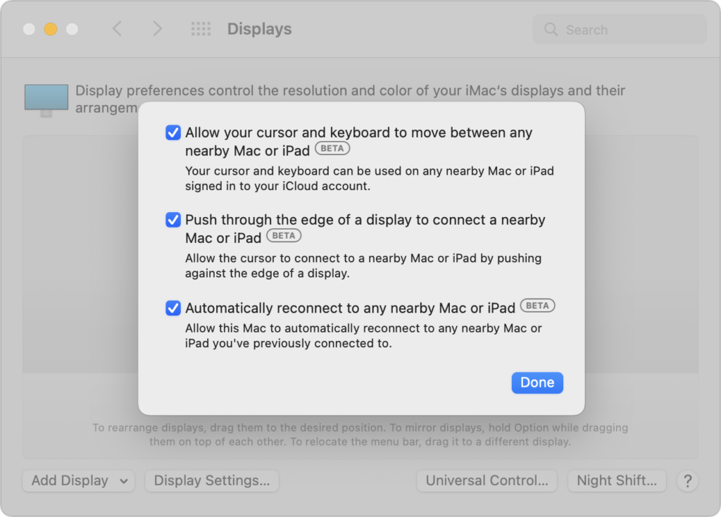
The only trick with setting up Universal Control is that it must be initiated from a Mac. Open System Preferences > Displays, click the Universal Control button, and in the dialog that appears, enable all three switches. Only the first one is necessary; the other two make connecting in the future easier.

After you click Done, you’ll return to the Displays preference pane, where any available Macs and iPads should appear, much like they were external monitors. If they don’t show up, click the Add Display pop-up menu and select the device you want to control under “Link Keyboard and Mouse.” You can also select them in Control Center, after clicking Displays. As long as you’ve selected “Automatically reconnect to any nearby Mac or iPad,” you shouldn’t have to repeat this step.

(The “Mirror or Extend to” section of the Add Display pop-up menu is where you select devices to use as external displays for your Mac. Macs running Monterey appear here courtesy of AirPlay, as do Apple TVs; iPads appear thanks to Apple’s Sidecar technology.)

Drag the device screen icons to match where they sit on your desk. The screenshot above indicates that you’d move the pointer from the double-screen iMac to the right to control the MacBook Air and down from the middle of the iMac screens to control the iPad.

When your pointer moves to another device’s screen, everything you do from then on will affect apps on that Mac or iPad, with one caveat. After the pointer moves to another device, you usually need to click once to create “focus,” which means specifying which window should receive subsequent clicks and keystrokes. If you forget to do this (it will become second nature quickly) and start typing, keystrokes will go to the previous device.

To help you move data between your devices, Universal Control offers two additional features beyond clicking and typing:

  • Copy and paste: As you might expect, you can copy data on one device with Command-C, move the pointer to another device, and paste it into an app on the second device with Command-V.
  • Drag and drop: Alternatively, you can drag files and other types of data from one device to another. This works well between Macs, and you can also move data between Macs and iPads in many situations, such as dragging an Apple Pencil sketch from an iPad and dropping it in a graphics app on the Mac. If a drag doesn’t work, try copy and paste or fall back on sharing the data via AirDrop or iCloud Drive.

Keep in mind that once you’ve turned it on, Universal Control has no concept of primary and secondary devices. In practice, you’ll probably use one keyboard and pointing device to control everything, but that’s not necessary. You can use a trackpad and keyboard connected to any device to control any other device, switching whenever you’d like.

Since Apple labels Universal Control as a beta, you may experience occasional dropouts or rough edges. If it loses track of a device, try putting the device to sleep and waking it again, and if that doesn’t work, open the Displays preference pane and select the device from Add Displays again.

Controlling one Mac from another is extremely fluid because the pointer and keyboard act exactly as expected. However, if you haven’t previously used a trackpad and hardware keyboard with an iPad, you may find its approach somewhat surprising. It’s a hybrid between a traditional pointer and a touchscreen, so the pointer is attracted to Home screen icons and many other controls, transforming it into a selection highlight. Either way, Universal Control just works. Give it a try!

(Featured image by Apple)


Social Media: With macOS 12.3 Monterey and iPadOS 15.4, you can now use your Mac’s keyboard and pointing device to control up to three other Macs or iPads with Apple’s new Universal Control. Learn more at:

If Your Internet Connection Is Slow, Research These Three Numbers

As pandemic-related restrictions ebb and flow, many people continue to work from home at least some of the time. A key requirement for successful remote work is a fast, solid Internet connection. Unfortunately, it’s all too common for Internet connections to degrade over time as cables endure a variety of insults ranging from water seeping into connectors to squirrels gnawing through insulation. You might be surprised at how variable such problems can be—we once saw an Internet connection that dropped out infrequently; it turned out that squirrels had damaged just one pair of wires in the cable, and the Internet provider’s system hopped between pairs depending on other neighborhood traffic.

How do you know if something in your Internet connection needs fixing? If the entire connection goes offline periodically, even if it comes back on its own, that’s a hint. Videoconferencing apps and streaming video services can also provide useful warnings—if the picture often pixelates or pauses, or if the audio falls out of sync with the video, that’s another indication that something may be wrong. Finally, if you use a VPN, Internet connectivity issues can cause all sorts of weird problems.

When you notice such problems, you can perform a simple test that may shed some light on the situation. First, make sure to stop any audio or video streaming or large downloads. Then go to speedtest.net and click the Go button. Speedtest will run some tests to come up with three numbers:

  • Download: Your download performance, generally measured in megabits per second (Mbps), is the most important and determines how quickly your computer can receive data from the Internet for downloads and streaming video.
  • Upload: Conversely, your upload performance, also measured in megabits per second, determines how fast you can send data to the Internet. It’s almost always much lower than download performance, but sufficient upload bandwidth is essential for your audio and video to be clear and smooth in a videoconference.
  • Latency: This number, which Speedtest calls “ping,” measures the amount of time in milliseconds to send a single packet to the destination server and receive it back again. The lower the latency, the more responsive communications will be, which is all-important for online gaming. Very long latencies can also cause problems for VPNs.

(You can also use other similar services, such as Netflix’s fast.com or Google’s built-in tester. Apple even built a networkQuality tool into macOS 12 Monterey—run it at the command line in Terminal—though it has an unusual Apple Network Responsiveness test that replaces the latency test.)

What should these numbers be? When you signed up for a plan with your Internet service provider (ISP), you should have been quoted download and upload numbers, such as 200 Mbps down and 10 Mbps up. If you don’t know what those numbers should be, ask your ISP. It’s not uncommon for download and upload speeds to vary somewhat from what you were promised, but they should generally be close.

Latency is trickier, and ISPs won’t promise anything specific. The lower the latency number, the better. Speedtest suggests that times under 59 milliseconds are good for gaming, times between 60 and 129 milliseconds are acceptable, a range of 130–199 milliseconds is problematic, and 200-plus milliseconds won’t be usable. There’s no way to know what latency numbers might cause other problems, but we’d pay attention to anything over 100 milliseconds.

Let’s assume your numbers aren’t what they should be—or at least what you’d like them to be. Don’t complain to your ISP right away. Instead, try these steps:

  • Run the test a few more times, preferably at different times of the day. (If you create an account with Speedtest, it will track your tests so you can see how they change.) You may discover that performance is slow only during peak usage hours.
  • Run more tests using different Speedtest servers or even different testing services. You’re testing the performance between you and a particular server, and it’s possible that server is having problems that others won’t share.
  • If you have other devices, run tests from those as well. Don’t assume you’ll get identical results because different devices may have varying capabilities. If you notice differences between devices that use Wi-Fi and those connected via Ethernet, that might point to your Wi-Fi router as a bottleneck. That’s not common with modern Wi-Fi routers, but if you’re still relying on an old AirPort Express, it could be slowing you down.
  • Restart your devices, and if that doesn’t make a difference, restart or power cycle your router and modem as well.

If your performance problems persist through all those troubleshooting tests, the problem is likely in the physical connection, and only your ISP can address that. When you call, be sure to share the testing numbers and any commonalities—times of day, for instance—that you observed. With luck, they’ll be able to confirm your issues and dispatch a technician to evaluate the physical connection for problems.

(Featured image by iStock.com/gorodenkoff)


Social Media: Slow or unreliable Internet connection? It could be your ISP—read on to find out how to test your connection and evaluate the results.

Plan for the Future by Establishing a Legacy Contact

Have you heard the expression “hit by a bus”? It’s a somewhat macabre attempt to inject a little levity into planning for the unthinkable event of dying without warning. No one expects to be hit by a bus, but people do die unexpectedly in all sorts of ways. That’s terrible, of course, but it’s also incredibly hard on that person’s family, who suddenly must deal with an overwhelming number of details. Many of those details revolve around the deceased’s digital life—devices, accounts, passwords, subscriptions, and more.

We strongly encourage everyone, regardless of age or infirmity, to think about what your family would want and need to do with your digital presence in the event of your death. The ultimate guide to this topic is Joe Kissell’s book Take Control of Your Digital Legacy, although the current version is a little out of date and is slated for updating in 2022.

The next edition of that book will undoubtedly discuss Apple’s new Legacy Contact feature, introduced in iOS 15.2, iPadOS 15.2, and macOS 12.1 Monterey. It enables you to specify one or more people as a Legacy Contact. Should you die unexpectedly, those people can use an access key along with your death certificate to access much of your Apple content and remove Activation Lock from your devices. (If you have time to prepare for your passing, it’s easier to share all your passwords and passcodes explicitly.) The person or people you set as Legacy Contacts don’t have to be running Apple’s latest operating systems or even be Apple users, though it’s easier if they are. (Like so many other things in life.)

Don’t put off specifying someone as a Legacy Contact, whether it’s a family member or close friend. The entire point of the “hit by a bus” scenario is that it’s both unexpected and could happen at any time. (It’s possible to get access without being a Legacy Contact, but it requires a court order and will undoubtedly be significantly more work.)

Apple provides good directions for the Legacy Contact feature, and while we’ll summarize the steps below, read Apple’s documentation to get the word from the horse’s mouth. Apple’s support pages include:

What Data Can a Legacy Contact Access?

Apple has the full list at the link above, but in short, a Legacy Contact can access anything stored in iCloud, including photos, email, contacts, calendars, messages, files, and more, as well as the contents of iCloud Backup. Not included are licensed media (music, movies, and books), in-app purchases (upgrades, subscriptions, and game currency), payment information (Apple ID payment info or Apple Pay cards), and anything stored in the account holder’s keychain (usernames and passwords, credit card details, and more). A Legacy Contact cannot access the deceased’s devices—Apple is incapable of sharing passcodes. However, Apple can remove Activation Lock so those devices can be erased and reused.

How Do You Add a Legacy Contact?

Adding someone as a Legacy Contact is easy. You must be running iOS 15.2, iPadOS 15.2, or macOS 12.1 Monterey to initiate the process, and two-factor authentication must be turned on for your Apple ID (this is a very good idea anyway).

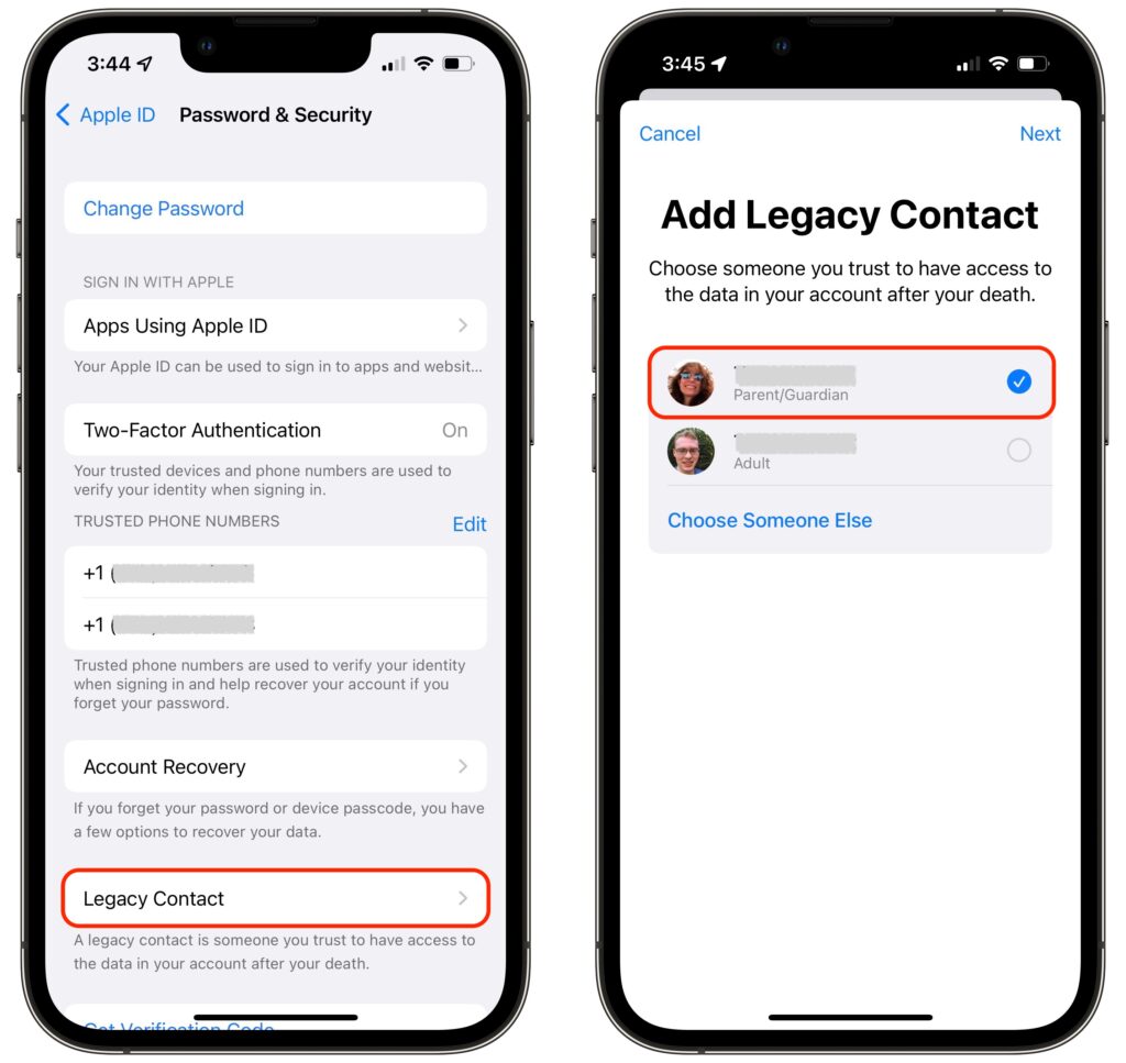
On an iPhone or iPad, go to Settings > Your Name > Password & Security > Legacy Contact > Add Legacy Contact. On a Mac, use System Preferences > Apple ID > Password & Security > Legacy Contact > Manage. You can choose a group member if you’re in a Family Sharing group or pick someone from your contacts list.

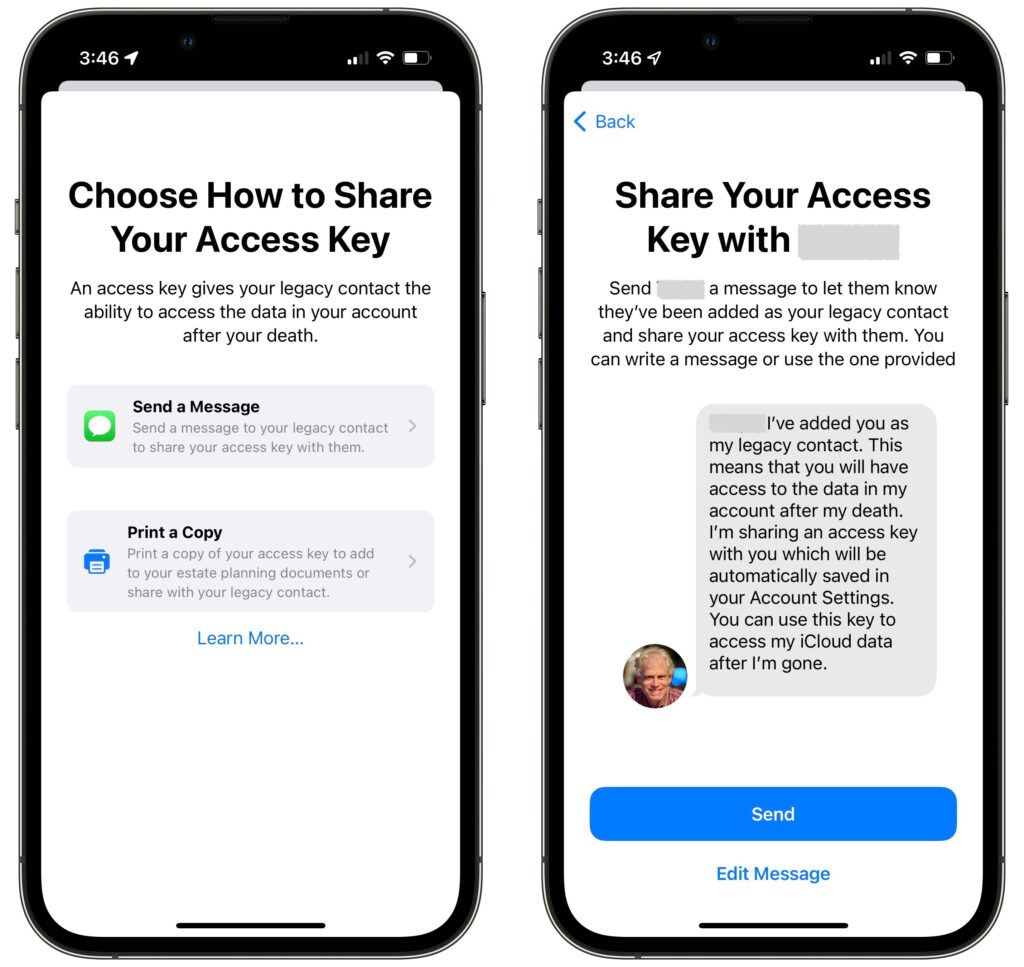
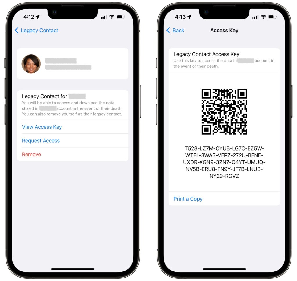
As part of the process of picking someone, Apple allows you to share the access key via Messages if they’re running iOS 15.2, iPadOS 15.2, or macOS 12.1 Monterey. If they accept, a copy of the access key will automatically be stored in their Apple ID settings. If they’re not running a necessary operating system or don’t use an Apple device, you can instead print out an access key QR code and give that to them. You might also want to print a copy to store with your will and other important documents.

It may often be appropriate to act as a Legacy Contact for the people you’re asking to be your Legacy Contacts, particularly with spouses or adult children.

How Does a Legacy Contact Request Account Access?

Let’s assume the worst and pretend ​​that someone who has added you as a Legacy Contact has passed away. To request access to their Apple ID, you need the access key that the person shared with you and a copy of their death certificate. You can find the access key on an iPhone or iPad in Settings > Your Name > Password & Security > Legacy Contact > Contact’s Name, and on the Mac in System Preferences > Apple ID > Password & Security, where you click Manage next to Legacy Contact settings and then Details next to the person’s name. It’s also possible that the person shared the access key as a document stored with their estate planning documents.

The screens that provide the access key also have a Request Access link. Tap or click that and follow the instructions to upload the death certificate. If you don’t have an appropriate Apple device, you can also do this on the Web at Apple’s Digital Legacy – Request Access page.

Apple evaluates all access requests to make sure they’re legitimate, and once approved, sends you an email with more details and instructions. That email will also include a special Legacy Contact Apple ID that replaces the deceased’s previous Apple ID. You can use that Apple ID to log in to iCloud.com or download data at privacy.apple.com, sign in to an Apple device, or restore an iCloud backup to another Apple device. Having an access request approved also removes Activation Lock from the deceased’s Apple devices so you can restore them to factory settings and set them up again, either fresh or with the Legacy Contact’s Apple ID’s data.

The main limitation is that the Legacy Contact Apple ID is good only for 3 years, after which the legacy account is permanently deleted. So be sure to download everything important fairly quickly—don’t just keep using the Legacy Contact Apple ID or assume that you’ll be able to go back to it at any time.

We sincerely hope that you never have to act as Legacy Contact for a loved one, but we can say from experience that this new feature can only help make an already stressful time more manageable.

(Featured image by iStock.com/Olga Serba)


Social Media: Apple’s new Legacy Contact feature makes it simpler for you to give a family member access to your iCloud data after your death. Read on to learn how to make someone a Legacy Contact or what to do if you are a Legacy Contact.

FaceTime Gains Cool New Features in Apple’s Latest Operating Systems

It’s no exaggeration to say that videoconferencing went mainstream during the pandemic. However, Apple’s FaceTime didn’t stack up well against Zoom and others due to its emulation of the telephone call experience, questionable interface decisions, and lack of cross-platform compatibility. However, with iOS 15, iPadOS 15, and macOS 12 Monterey, Apple has nearly brought FaceTime into feature parity with Zoom and others and it has even added a few features that break new ground.

FaceTime Links

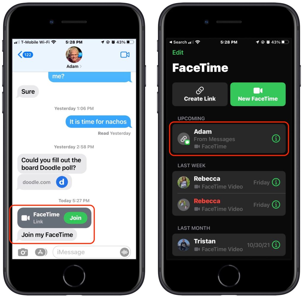
One of the smallest new features in FaceTime may be the most important. No longer do you have to call others via FaceTime, an awkward approach left over from the days of landlines. That’s still possible, but it’s easier and more considerate to make and share a FaceTime link instead, which lets others join your call when they’re ready. FaceTime links make it effortless to rejoin a call if you have to drop off or if something goes wrong, and they simplify switching from one device to another. You can share FaceTime links like any other Web link, through Messages, email, discussion systems like Slack, or posting on a Web page.

To create a FaceTime link, launch the FaceTime app and use the Create Link button in the upper left. If you’re creating it in iOS 15 or iPadOS 15, you can add a name before copying or sharing the link in the share sheet. In Monterey, clicking the button presents a sharing menu with similar appropriate options.

To join a call, all a recipient of the link has to do is tap or click the link. If they’re running one of Apple’s latest operating systems, the call will also appear in the FaceTime app, under Upcoming.

Either way, people joining the call get a preview window in which they can adjust their video and mic settings. After they hit the Join button, the organizer is notified that they’re waiting and can add them to the call. (That may seem like an unnecessary extra step, but it ensures random trolls can’t join FaceTime calls whose links have been shared publicly.)

If you’re scheduling a call, you can create a FaceTime link within an event in Calendar. That’s handy to make sure you have the link available at the right time, to make it available on all your devices, and to let others access it via a shared calendar. Use the Location or Video Call field, and select FaceTime when it’s offered. The event then gets a Join button that makes it easy to access the call. (If you’re sharing the calendar with someone who isn’t using one of Apple’s latest operating systems, they’ll just see a link they can click.)

Despite being associated with an event, such FaceTime links aren’t time-specific. You can start the call any time you want, and anyone else can attempt to join it at any time, but they’ll be able to get in only if you as the organizer let them in. So it won’t do them any good to join before or after the scheduled time.

FaceTime Web App

FaceTime links are also essential for allowing FaceTime calls to include those who aren’t running Apple’s latest operating systems. If you’re still on macOS 11 Big Sur or iOS 14, opening a FaceTime link switches to Safari and opens the FaceTime Web app. That also works for those using Android, Windows, or Linux, as long as they have a compatible Web browser, which means Google Chrome or another Chrome-based browser like Brave or Microsoft Edge. Firefox won’t work.

For the most part, the FaceTime Web app works just like the native FaceTime app, with the ability to change basic camera and microphone settings and support for grid view. There are two notable limitations:

  • FaceTime Web app users can only join calls, not initiate them.
  • Advanced options like the mic modes and video effects aren’t available.

Mic Modes and Video Effects

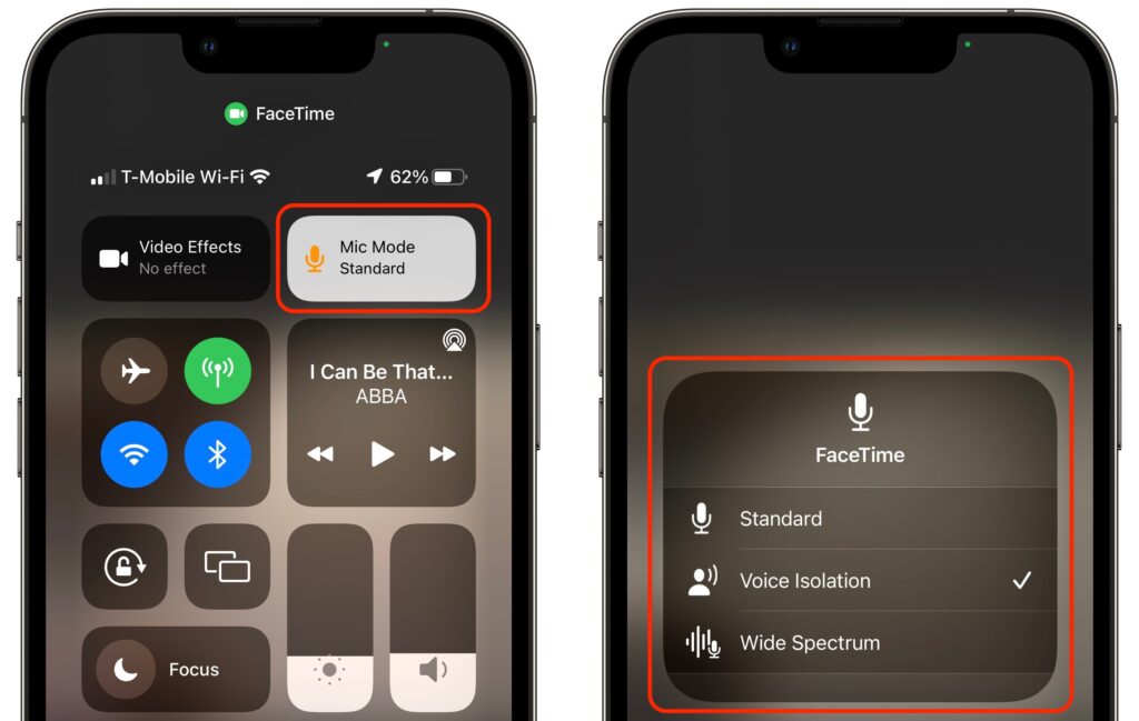
In an effort to catch up with the likes of Zoom, Apple added several audio and video features to FaceTime. There are now three mic modes that you can enable in Control Center during a call:

  • Standard: FaceTime does nothing special to the audio.
  • Voice Isolation: FaceTime focuses on your voice, working to eliminate non-vocal sounds and other background noise.
  • Wide Spectrum: FaceTime expands its attention to all the sounds in the room, which is essential for things like music lessons.

Although the equivalent Control Center button is labeled Video Effects, there’s only one at the moment: Portrait mode. It works exactly as it does in the Camera app for photos, keeping you in focus and blurring the background. Perhaps Apple will add other video effects in the future, much like Zoom’s virtual backgrounds and immersive sets. You can also toggle Portrait mode by tapping the Video Effects button in your FaceTime tile.

The Voice Isolation and Wide Spectrum mic modes, and the Portrait mode video effect, are available only on iPhones and iPads that have an A12 Bionic chip or later, or an M1 chip. Similarly, they work only on M1-based Macs, not older Intel-based Macs.

Grid View

When Apple first introduced FaceTime group calls, participants’ tiles would swim around on the screen, moving and expanding to indicate who was speaking. It was dizzying. Happily, Apple finally listened to annoyed users and has now introduced a simple grid view like every other videoconferencing app on the planet.

Once there are four or more participants in a call on an iPhone or iPad, a Grid button appears when you tap the screen to reveal the FaceTime controls. Tap it to switch into or out of grid view. In Monterey, there’s an always-visible Grid button in the upper-right corner.

Screen Sharing for iPhones and iPads

As helpful as FaceTime links are, our favorite new feature of FaceTime is screen sharing for those using an iPhone or iPad. (Macs can’t currently participate in FaceTime screen sharing but have their own screen sharing capabilities, accessed through the Conversations menu in Messages.) With a couple of taps, you can share your screen with someone else, or they can share their screen with you, all while maintaining the video call. For many remote workers, this feature is essential, whether you are collaborating on a project or showing your work to your boss. Another obvious use is remote tech support. If someone is having trouble accomplishing something on their iPhone or iPad, you can see what’s going wrong live on a FaceTime call. And kids, no doubt, will find many fun things to do together.

To share your screen during a FaceTime call, tap anywhere on the screen to reveal the FaceTime controls, tap the screen sharing button on the right, and tap the Share My Screen confirmation prompt. After a 3-second countdown, others on the call can see your screen, even as you switch away from the FaceTime app and use your iPhone or iPad however you want.

While you’re sharing your screen, a purple status icon reminds you that others can see what you’re doing. To stop sharing your screen, tap someone’s video tile to switch back to the FaceTime app and tap the screen sharing button again.

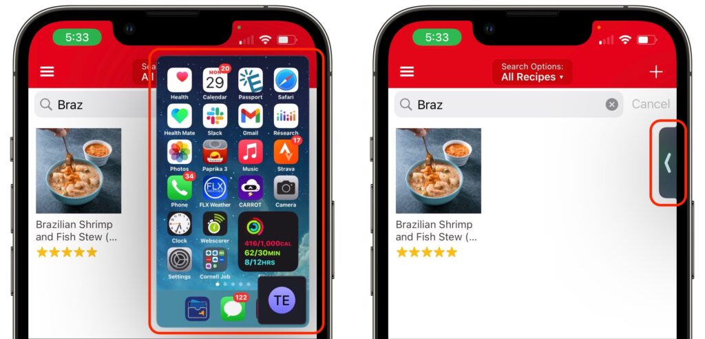
When someone shares their screen with you, a Picture-in-Picture (PiP) window of their screen appears. Tap it to expand it to the entire screen, moving the FaceTime call video to its own PiP window. Tap that FaceTime PiP window to return to the call. If you switch to another app, as shown below, the shared screen returns to being a PiP window. If any PiP window is in your way, you can drag it to another corner or swipe it off the screen to the left or right to hide it entirely. A tab appears to indicate the hidden PiP window; tap it to bring the window back.

SharePlay

People will either love SharePlay or ignore it entirely. It enables everyone on a FaceTime call to watch the same video or listen to the same audio while continuing the conversation. The big caveat is that everyone must have legal access to the content, which generally means a subscription to whatever service is being used, whether that’s Apple Music, Apple TV+, Disney+, HBO MAX, or Paramount+. Currently, SharePlay works only in iOS 15 and iPadOS 15 and on the Apple TV running tvOS 15. It’s slated to appear in a future version of Monterey, perhaps 12.1.

Initiating a SharePlay session is easy: simply navigate to Apple’s TV or Music app, or another app that supports SharePlay, and start playing something. You may be asked if you want to play it for everyone or just for yourself, or you may be told the content will play automatically. Assuming everyone on the call has the necessary subscription, the audio or video starts playing instantly.

What’s a little freaky about SharePlay is that, with one minor exception, everyone is an equal participant. If you start playing something, someone else can pause it or rewind it, say, and the video will pause or rewind for everyone. The exception is that only the person who started playing a video can stop it (tap the screen to reveal the controls), although anyone can start playing something else to replace it.

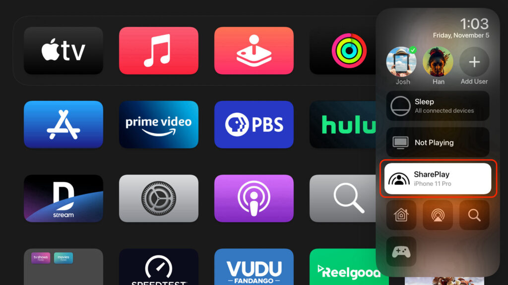
If you have an Apple TV, you can initiate video playback from the Apple TV or move something that’s already playing to the Apple TV. While you’re on a FaceTime call on your iPhone or iPad, press and hold the TV button on the Apple TV’s remote to open Control Center, and then select the SharePlay button that appears there to get started.

With all these new features, it’s time to rethink how you use FaceTime, and that’s especially true if you haven’t been using FaceTime because it lacked the features in some other videoconferencing app.

(Featured image by iStock.com/jacoblund)


Social Media: FaceTime has joined the big leagues in iOS 15, iPadOS 15, and macOS 12 Monterey. Read on to learn about FaceTime links, its cross-platform Web app, special mic modes and video effects, grid view, screen sharing, and SharePlay.

Four Ways to Reduce Zoom Fatigue

After a long day of video calls, you might feel like your brain has been wrung out like a wet washcloth—we certainly do. It’s exhausting to stare into a computer for hours every day while participating in meetings or classes. This condition is called Zoom fatigue, and it’s a recent affliction for most of us because the pandemic has dramatically increased the popularity of video calls. We don’t mean to beat on Zoom here—this condition plagues people who use Cisco WebEx, FaceTime, Google Hangouts, Google Meet, Microsoft Teams, Skype, and other videoconferencing software too.

But there are techniques you can employ to reduce Zoom fatigue. Researchers at Stanford University have identified four reasons why video calls are so tiring and offer suggestions on making them less so. They include:

  • Close-up eye contact is overwhelming. You usually sit about an arm’s length from your computer display, and if one person is on screen at a time, their head may be close to life-size. You’d never be that near someone’s face in real life unless they were a close family member, and even then, you wouldn’t hold that position for long. Shrink your window or switch to gallery view so you’re talking to postage stamps rather than feeling like someone is up in your face.
  • Looking at yourself is psychologically harmful. We all have mirrors, but can you imagine staring into one for hours every day? Only a pathological narcissist would do that. Worse, constantly seeing your own image can make you worry about your appearance and what others think of you. Once you’ve verified that you’re properly framed and don’t have salad in your teeth, hide your preview or switch to a view that doesn’t include you.
  • Sitting perfectly still is difficult. This is hardest on kids, but even adults have trouble staying sufficiently still to remain perfectly framed in a video window. When you’re on a standard phone call or in an in-person meeting, you might pace around the room or at least adjust your position in your chair. Try turning off your camera when possible—most calls work just as well without video—or position it so you can fidget or pace in person. Another solution is Apple’s Center Stage technology on the new M1-based iPad Pros, which automatically pans and zooms to keep you in the picture as you move around.
  • Video calls make you constantly think about call mechanics. There’s nothing natural about interacting with multiple people on a screen, so we’ve all come up with behaviors (some of which we just recommended!) to smooth over the cracks in the system. For instance, your brain has to expend extra effort to help you stay framed in the video window, worry about how you look, use exaggerated facial expressions so people know you’re paying attention, and use techniques like a thumbs-up to indicate approval without unmuting. The solution is to turn off your camera and hide the video window so your brain can take a break and focus on just the audio content of the call.

You’ll notice that most of the recommendations for reducing the mental strain of video calls come down to eliminating video. It shouldn’t be surprising because talking on the phone isn’t nearly as tiring, even when you’re on a conference call with a couple of people. There’s no question that video can help convey information that would be lost in a phone call, and it’s nice to see far-flung friends and family, but there’s no rule that video calls are the best form of communication for all situations.

We’ve started to put these recommendations into practice ourselves, and we encourage you to do so as well. And if you need support for why you’re turning off your camera or asking for audio-only calls, send people a link to this article.

(Featured image by Anna Shvets from Pexels)


Social Media: Why are video calls so exhausting when all you’re doing is sitting around and talking? Here’s the word from Stanford University researchers, along with advice on making those non-stop calls less tiring.

How to Avoid Embarrassment During Online Presentations or Screen Sharing

Along with the now-ubiquitous videoconferencing, screen sharing and online presentations have become vastly more common during the pandemic. This isn’t yet another article about how to give a better presentation or feel more confident. (Although those might happen too.) The goal of this article is to help you avoid situations that could embarrass you in front of clients, colleagues, or bosses. Follow this advice and you could avoid an unfortunate happenstance that might even cause you to be fired.

Here’s the problem. Even more so than before the pandemic, our Macs feel like personal spaces. Just as you’d add a houseplant and a special photo to your desk at work, you’ve probably personalized your Mac in a variety of ways. Custom desktop wallpaper, for instance, or a screensaver that displays favorite photos. Plus, you may carry on personal conversations, possibly even intimate ones, if you catch our drift, using the same Mac that you use for communicating with those aforementioned clients, colleagues, and bosses.

We’re not here to admonish you or nag about inappropriate behavior. (Though we will encourage you to consider some sage advice from a friend’s mother, who noted drily that you should never put anything on the Internet that you don’t want to appear on the front page of the New York Times. And that was before Twitter.)

No, as we said, the goal here is to help you avoid the embarrassment caused by people who are viewing your screen seeing things they shouldn’t see, something that the New York Times has also covered. Some areas of concern include:

  • Desktop & Screen Saver: Jobs have been lost by inappropriate selections for desktop wallpaper and photo screen savers. Make sure, if you’re ever going to share your screen, that randomly chosen desktop pictures and folders of screen saver photos don’t contain anything that could be problematic. To be safe, choose an Apple-provided desktop picture and a pattern-based screen saver in System Preferences > Desktop & Screen Saver.
  • Icons on the Desktop: We all toss files on the desktop, but if preview icons or even filenames could cause trouble—you might not want your boss seeing Resumé.doc—corral them in another folder before you share your screen. Also note that many videoconferencing apps can limit their screen sharing to particular windows rather than the entire screen, which prevents people from seeing your desktop.
  • Web browser tabs: Limiting screen sharing to a particular window won’t help if it’s a Web browser window with multiple tabs. Even if you avoid accidentally navigating to a tab with NSFW content, its title alone might be problematic. For safety, always start a new browser window when sharing Web content.
  • Open apps and documents: As with icons on the desktop when sharing your entire screen, you may not want just anyone seeing what other apps and documents you have open. Again, stick to sharing a specific window. To avoid mistakes when selecting the window to share, we recommend hiding or quitting all unrelated apps before sharing your screen.
  • Document comments: When collaborating on a document, some people are less than politic with their in-document comments. If comments are visible when you’re sharing a document with people who wouldn’t otherwise see them, hard feelings could ensue. Make sure to hide or resolve such comments before sharing.
  • Notifications: Even if you have hidden or quit Calendar, Messages, Mail, and similar apps, their notifications could still appear at an inopportune time. You might not want colleagues to know about an ob-gyn appointment, meeting with a potential employer, or racy conversations with a coworker. The solution is Do Not Disturb, easily enabled from Control Center in macOS 11 Big Sur and by scrolling up in Today view in Notification Center in earlier versions of macOS. Also, although it won’t help with online screen sharing, it’s a good idea to enable the “When mirroring to TVs and projectors” option in System Preferences > Notifications > Do Not Disturb.

This may all sound a little overwhelming, but there is one trick that will help you avoid most of these problems at once. In System Preferences > Users & Groups, create a new user account dedicated to screen sharing and presentations. In that user account, you can be sure to have innocuous desktop pictures, screen savers, clean Web browser windows, and permanent Do Not Disturb. The hardest part will be figuring out the best way to share documents you use in presentations between your accounts (try the /Users/Shared folder or an online file sharing solution like Dropbox). Then, before you start a call when you’ll need to share your screen, choose your new account from the Fast User Switching menu from the right side of the menu bar (set up that menu in System Preferences > Users & Groups > Login Options).

One final piece of advice. When you’ve accomplished what you need to by sharing your screen, stop sharing it and switch back to video. That way, you can’t accidentally do something in the shared window that might be embarrassing. Similarly, when a meeting is over or you’re dropping off for a while, it’s best to leave the call. Stopping video and muting audio are good tools, but it’s easy to click in the wrong spot accidentally and think you’re safe when, in fact, your mic or camera is still live.

(Featured image by Andrea Piacquadio from Pexels)


Social Media: When sharing your screen online, would you be embarrassed if your clients, colleagues, or bosses saw what’s on your Mac—your desktop picture, screen saver, browser tabs, email notifications, or Messages conversations? Here’s what to watch out for.

Use Guided Access to Let Kids and Others Use Your iPhone Temporarily

Let’s get one thing straight. You know that you should never, ever share your iPhone or iPad passcode with anyone you don’t trust implicitly, like a spouse or adult child, right? That’s because, with your iOS passcode, someone could change your Apple ID password, and if you use iCloud for email, completely steal or otherwise abuse your online identity. (Scared? Good. If you’ve given anyone your passcode, go change it right now. We’ll wait.)

So if sharing your passcode is such a terrible idea, how do you let someone else use your iPhone or iPad temporarily? Perhaps you want to let your kid play a game in the car while you focus on tricky winter driving. Or maybe you time running races with an iPhone app and want someone to do the timing without giving them full access to your iPhone. Whatever the reason you want to give someone limited access to a single app in iOS 13, the solution is Guided Access.

Enabling and Configuring Guided Access

To turn Guided Access on, navigate to Settings > Accessibility > Guided Access (it’s near the bottom), and flick the switch. While you’re here, check out the remaining settings:

  • Passcode Settings: Create a passcode for getting out of Guided Access here (it can be different than your normal one), and choose whether you can use Touch ID or Face ID to exit as well.
  • Time Limits: You don’t set time limits here, but you can set audio and spoken warnings before the time runs out.
  • Accessibility Shortcut: Enable this if you also use triple-click for another Accessibility Shortcut like Magnifier.
  • Display Auto-Lock: Choose how long the device can be inactive before the screen turns off. If the Guided Access user wakes up the device, they’ll still be in Guided Access.

With those settings configured, switch to the desired app and triple-click the side or Home button, and if necessary, tap Guided Access in the Accessibility Shortcut list. You can do five things:

  • Set session-specific options: Tap Options in the lower-right corner to access various switches. If they’re disabled:
    • Side Button or Sleep/Wake Button: The user can’t put the device to sleep.
    • Volume Buttons: The user can’t change the volume.
    • Motion: The screen doesn’t change from the orientation (portrait or landscape) it was in when you started Guided Access.
    • Touch: The user can’t do anything with the screen at all—probably most appropriate for letting a young child watch a video.
    • Dictionary Lookup: Prevents word lookups in some apps.
  • Set time limits: At the bottom of the Options list, tap Time Limit and set an amount of time after which the device can’t be used until you enter the Guided Access passcode.
  • Disable specific areas on the screen: Draw circles around parts of the screen you want to make off-limits to the user. After making a circle, you can move it by dragging it, resize it by dragging any of its handles, or remove it by tapping its X button.
  • Start/Resume Guided Access: In the upper-right corner, tap Start. If you haven’t yet set a passcode, you’ll be prompted to do that.
  • Exit the setup screen: In the upper-left corner, tap End.

Using Guided Access

Once you tap Start, iOS tells you it’s entering Guided Access and lets you use the current app with the restrictions you’ve applied. If you decide that the restrictions aren’t right, triple-click the side or Home button to return to the setup screen. When you’re done, tap Resume in the upper-right corner.

To leave Guided Access, triple-click the side or Home button, enter the passcode, and in the setup screen, tap End in the upper-left corner.

That’s it! Once you understand the various limitations of Guided Access, you’ll be able to turn it on and off quickly whenever you need to let someone use your iPhone or iPad for a while.

(Featured image by mohamed Abdelgaffar from Pexels)


Social Media: Never, ever share your iPhone or iPad passcode with anyone who you don’t trust implicitly. Instead, you can give people limited access to a single app with Guided Access. Learn more here:

iOS 13 Makes Editing Text Easier

Let’s be honest—text editing in iOS has never been anywhere near as good as it is on the Mac. We may be more accustomed to our mice and keyboards, but the Multi-Touch interface has always been clumsy when it comes to text. Apple keeps trying to improve iOS’s text editing features, and iOS 13 (and iPadOS 13) brings some welcome changes in how we go about positioning the text insertion point, selecting text, and performing the familiar options in the Mac’s Edit menu: Cut, Copy, Paste, and Undo/Redo. Has it caught up with the Mac yet? You’ll have to decide that for yourself, once you’ve learned the new techniques.

Note that these changes apply only to spots in iOS where you’re entering and editing text, not selecting and copying static, read-only text such as a Web page in Safari. And even when you are working on a Web page where you can enter and edit text, the site may override iOS’s text handling.

Insertion Point Positioning

Positioning the insertion point on the Mac is easy—you move the cursor to the right spot and click. In previous versions of iOS, you could tap to put the insertion point at the start or end of a word, or press and hold briefly to bring up a magnifying glass that let you put the insertion point anywhere, including within a word. It was slow and awkward, and made better mostly by trackpad mode, which you could invoke by long-pressing the Space bar.

iOS 13 improves positioning by letting you press and hold the insertion point to pick it up and then drag it to where you want it. This approach is much easier and more sensible than the previous method.

Selecting Text

On the Mac, you can select text with multiple clicks, by clicking and dragging, or by using the keyboard. In iOS, however, text selection has always been tough—you could double-tap to select a word, but anything else required subsequent moving of start and end markers. (On an iPad with a keyboard, you could hold Shift and use the arrow keys too.)

Happily, iOS 13 improves text selection. To start, you can still double-tap to select a word, but you can also triple-tap to select a sentence (shown below) and even tap four times in quick succession to select an entire paragraph. Unfortunately, these selection shortcuts may not work in all apps, but you can always fall back on the previous approach.

For selections of an arbitrary length, just press, pause ever so briefly to start selecting, and then drag to extend the selection. In other words, it’s as close to the Mac approach as is possible with the Multi-Touch interface. If the selection isn’t quite right, you can adjust the start and end markers.

Cut, Copy, Paste, and Undo Gestures

Everyone knows Command-X for Cut, Command-C for Copy, Command-V for Paste, and Command-Z for Undo on the Mac. In previous versions of iOS, those commands were available only from a popover that appeared when text was selected, or (for Paste) when you pressed and held in a text area. The only command with a gesture, so to speak, was Undo. At the risk of dropping it, you could shake your iOS device to undo your last action. Not good.

iOS 13 introduces a variety of three-finger gestures to make these commands quick and easy to invoke. Note that you can use the entire screen for these gestures—it’s OK to make them with one finger over the keyboard.

  • Copy: To copy selected text, pinch in with three fingers, or, more likely, your thumb, index finger, and middle finger.
  • Cut: To cut (copy and then delete) selected text, perform the copy gesture twice in quick succession.
  • Paste: To paste the text you’ve copied at the insertion point, reverse the action—pinching out (spreading) with three fingers.
  • Undo: To undo a mistake, immediately swipe left or tap twice with three fingers. You can keep swiping or double-tapping to undo more actions.
  • Redo: To redo the action that you just undid, swipe right with three fingers.

Whenever you use one of these gestures, a little feedback badge appears at the top of the screen to reinforce what you just did.

If you can’t remember which direction to pinch or swipe, press and hold with three fingers anywhere for a second to see a shortcut bar at the top of the screen with icons for Undo, Cut, Copy, Paste, and Redo.

Finally, instead of using Cut and Paste to move a swath of selected text, try dragging it to the new position.

Slide to Type

Various third-party keyboards have provided “slide-to-type” over the years, letting you type a word by sliding your finger from letter to letter on the keyboard without lifting it up in between. But switching to a third-party keyboard meant that you often gave up useful other features, like Siri dictation, so most people stuck with Apple’s default keyboard.

On the iPhone, iOS 13 now lets you slide to type on its default keyboard, and it works surprisingly well. In iPadOS 13, slide-to-type works only on the new floating keyboard you can get by pinching with two fingers on the default keyboard (pinch out with two fingers to restore the default keyboard). When you get to the end of a word, lift your finger to insert it, and then start sliding again for the next word. If you make a mistake, the suggestions above the keyboard often provide the word you want. You can switch between tapping (best for unusual words) and sliding on a word-by-word basis.

Make a mistake with sliding? By default, tap Delete after inserting a slide-to-type word to delete the whole word, not just the final letter. If you don’t like that behavior, turn off Delete Slide-to-Type by Word in Settings > General > Keyboard.

(Featured image by Lorenzo Cafaro from Pixabay)


Social Media: Today’s article will make text editing in iOS 13 faster and more fun. Read about important new and improved techniques for selecting, copying, and moving text, plus a new slide-to-type option.

What Can You Store in Apple’s Wallet App? Credit Cards, Boarding Passes, Tickets, and More!

Have you wondered what you can do with the Wallet app on your iPhone? Although it started out life called Passbook, Apple soon realized that the only sensible name was Wallet. That’s because it stores digital versions of roughly the same sort of things you might put in a physical wallet: credit and debit cards, store cards, membership cards, and even cash (well, Apple Pay Cash, anyway).

Nearly all airlines can put your boarding passes in Wallet, too, and if you buy something like a concert ticket online, you may be able to add it to Wallet by tapping the “Add to Apple Wallet” button in the confirmation page or email. Having a boarding pass or ticket, which Apple calls a pass, in Wallet makes it easy to scan for a gate attendant.

Here’s how to use cards and passes in Wallet.

Display Your Cards and Passes

The main Wallet screen shows your cards and passes in a scrollable list, with credit/debit cards at the top. (If you’ve set up Apple Pay Cash, it’s treated as a debit card.)

To view more details about a card or pass, tap it.

In the case of a credit/debit card, you see the face of the card and a list of its recent Apple Pay transactions.

For boarding passes for multi-flight trips, you see a single pass in the main list, but after you tap it, you can swipe horizontally to display the pass for each leg of the trip.

Membership cards, such as the ChargePoint card, may work like credit/debit cards in that you need to hold them near a reader to sign in.

In each case, to access settings related to the card or pass, tap the black ••• button at the upper right.

Adding and Using Credit and Debit Cards

Adding a credit/debit card so it can work with Apple Pay starts with tapping the black + button at the upper right of the Wallet screen. From there, follow the prompts—you can scan your card with the camera instead of keying in the data.

If you add more than one card, you’ll want to specify which should be the default for Apple Pay. Go to Settings > Wallet & Apple Pay. Scroll down to Transaction Defaults, and tap Default Card. Tap the desired card. In Wallet, the default card appears with its full face showing, below your other credit/debit cards.

To pay for a purchase with a stored credit/debit card at a payment terminal, put your iPhone right next to the terminal. The iPhone may automatically prompt you to authenticate Apple Pay, but if not, double-click the Home button or, with the iPhone X, XR, XS, or XS Max, double-click the side button. Wallet displays your default card. To authenticate, rest your finger on the Home button or, with the iPhone X models, authenticate with Face ID. To use a non-default card, tap the card pile at the bottom of the screen and then tap the desired card.

Adding and Using Airplane Boarding Passes and Event Tickets

For flights, when you check in and get boarding passes using the airline’s iPhone app, you’ll be given the opportunity to tap an Add to Apple Wallet button. Do that and the boarding pass appears in Wallet, which will also display a notification for it on the Lock screen in the hours before your flight. When you need to show the boarding pass to security or the gate attendant, tap that notification to display the boarding pass with its QR code.

For events, the ticket-seller may display the Add to Apple Wallet button on the confirmation page of the checkout process or attach the tickets to your email receipt. In the latter case, open the message in Mail and tap the attachment to open it, and then tap Add to put it into Wallet. Later, when you arrive at the venue, open Wallet and display the ticket—again with a QR code—to gain entry.

Deleting Cards and Passes

Although you may want to keep some digital tickets for nostalgic reasons, it’s best to clean out old items:

  • To delete a credit/debit card, tap the card to view it and then tap the black ••• button. Scroll down and tap Remove This Card.
  • To remove a pass, go to the bottom of the main Wallet screen and tap Edit Passes. Tap the red delete button for that item, tap the next Delete or Delete All button, and then tap Done at the upper right.

Using Wallet makes it easier to keep your physical wallet slimmer. It can take a few minutes to add your cards and passes initially, but it’s worth the effort.

(Featured image by Two Paddles Axe and Leatherwork on Unsplash)


Social Media: Want to reduce the thickness of your wallet? Try offloading some cards to the Wallet app on your iPhone! Here are the basics: